
Website user experience (UX) is defined as the quality of every interaction a visitor has with your site, from the first page load to the final conversion. The steps to improve website user experience in 2026 center on three measurable pillars: technical responsiveness measured by Interaction to Next Paint (INP), legal accessibility compliance under WCAG 2.2 and the European Accessibility Act, and navigation clarity that guides visitors toward conversion. Business owners who apply these steps systematically see higher engagement, lower bounce rates, and more leads. This guide gives you the exact framework to make that happen.
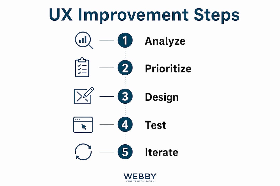
What are the critical steps to improve website user experience?
Responsiveness is the foundation of good UX. The industry standard, known as the Doherty Threshold, requires that system response stays under 400ms for interactions to feel immediate. When your site crosses that threshold, visitors perceive it as sluggish, and sluggish sites lose business.
INP replaced First Input Delay (FID) as the primary Core Web Vital in 2024. INP measures the visual response time to every user interaction throughout the full page lifespan, not just the first click. That shift matters because FID only captured the first interaction. INP catches slow responses on menus, forms, and filters that FID missed entirely.
Practical steps to monitor and improve INP:
- Run Google PageSpeed Insights on your key landing pages monthly.
- Use Chrome DevTools to identify long tasks blocking the main thread.
- Defer non-critical JavaScript so the browser prioritizes user input.
- Compress and lazy-load images to free up rendering resources.
- Test on real mobile devices, not just desktop simulators.
Pro Tip: Prioritize interaction responsiveness over raw page load speed. A page that loads in 2 seconds but freezes for 600ms when a visitor taps a button still fails the Doherty Threshold.
How to ensure your website meets accessibility standards in 2026?

WCAG 2.2 is the essential international accessibility standard for 2026. It introduced specific new success criteria covering Focus Appearance, Target Size, and Dragging Movements. Meeting these criteria is no longer optional. The European Accessibility Act began enforcement in june 2025, creating legal risk for businesses that ignore compliance.
The recommended minimum touch target size is 44×44 pixels. Smaller targets cause “fat finger” errors on mobile, frustrating visitors and increasing form abandonment. This single fix improves usability for every visitor, not just those with motor impairments.
Follow these steps to audit and fix accessibility:
- Run your site through WAVE or axe DevTools to identify color contrast failures and missing alt text.
- Test full keyboard navigation without a mouse. Every interactive element must be reachable and operable.
- Check that focus indicators are visible. WCAG 2.2 requires a minimum contrast ratio for focus outlines.
- Verify all touch targets meet the 44×44 pixel minimum on mobile.
- Review form labels. Every field needs a persistent label above it, not inside it as a placeholder.
| Accessibility check | WCAG 2.2 requirement |
|---|---|
| Focus indicator contrast | Minimum 3:1 ratio against adjacent colors |
| Touch target size | At least 44×44 pixels |
| Color contrast (text) | Minimum 4.5:1 for normal text |
| Keyboard navigation | All interactive elements reachable |
Pro Tip: Accessibility improvements benefit every visitor. Captions help people in noisy offices. High contrast helps users in bright sunlight. Good web accessibility practices also improve your SEO signals.
What are effective ways to improve site navigation and information architecture?
Clear navigation reduces friction and keeps visitors moving toward your conversion goal. The three-click rule is outdated. What matters is the “scent of information”: visitors stay engaged when each click feels like progress, regardless of how many clicks it takes.
Miller’s Law provides a practical limit for menu design. Chunk navigation into groups of about seven items maximum to reduce cognitive load. More than seven options in a single menu forces visitors to scan and re-scan, which increases the chance they leave. Apply this rule to both primary menus and dropdown submenus.
Mobile navigation deserves its own attention. Placing critical controls at the bottom of the screen within easy thumb reach outperforms top-corner placement. Most visitors hold their phone with one hand. A menu icon buried in the top-left corner requires an awkward grip shift that many visitors simply skip.
Key navigation improvements that deliver high ROI without a full redesign:
- Use descriptive menu labels. “Plumbing Services” beats “Services” every time.
- Add breadcrumb trails on pages deeper than two levels.
- Treat your footer as a resource map. Highly engaged visitors scroll to the footer looking for contact details, service lists, and policy pages.
- Install a heatmap tool to see where visitors click and where they stop scrolling.
- Use session recordings to watch real visitors navigate. You will spot friction points that analytics alone never reveal.
| Navigation approach | Outcome |
|---|---|
| Generic menu labels (“Services”) | Visitors guess what they will find |
| Descriptive labels (“Plumbing Services Perth”) | Visitors self-select with confidence |
| Top-corner mobile menu | Requires awkward grip shift |
| Bottom-screen mobile controls | Thumb-friendly, reduces drop-off |
| Footer as link dump | Missed opportunity for engaged visitors |
| Footer as resource map | Converts highly engaged visitors |
How to optimize website content clarity and calls to action?
Content clarity directly affects how long visitors stay and whether they convert. Short paragraphs, scannable headings, and plain language reduce the cognitive effort required to understand your offer. Visitors who have to work hard to read your content leave before they act.
Content must also provide unique “Information Gain” to perform well in search and keep visitors engaged. Generic or AI-generated summaries are penalized by search engines and ignored by visitors who have already read the same information elsewhere. Show first-hand experience, original photos, and specific data that only your business can provide.
Calls to action (CTAs) are where content clarity converts into revenue. Action-oriented CTA copy like “Get My Free Quote” outperforms generic labels like “Submit” because it tells the visitor exactly what happens next. Pair strong CTA copy with trust signals: client reviews, certifications, and case study results placed near the button reduce hesitation.
Content and CTA best practices:
- Write headings as direct answers to visitor questions, not clever marketing phrases.
- Keep paragraphs to three sentences or fewer on service pages.
- Place labels above form fields, never inside them as placeholders. Placeholder text disappears the moment a visitor starts typing, causing confusion and errors.
- Match CTA copy to where the visitor is in their decision. “Learn More” fits early-stage visitors. “Book My Inspection” fits visitors who have read your full service page.
- Add social proof within two scrolls of every primary CTA.
Pro Tip: Test two versions of your primary CTA copy for 30 days using a simple A/B test. A single word change from “Contact Us” to “Get My Free Quote” can meaningfully shift your conversion rate without touching your design.
What tools and methods help audit and continuously improve UX?
A UX audit is a structured review of your site’s performance, accessibility, and behavior data. Running one before making changes prevents you from fixing the wrong things. The goal is to identify blocking issues first, then address high-value tweaks second.
Start with performance and accessibility tools:
- Google PageSpeed Insights: measures INP, Largest Contentful Paint, and Cumulative Layout Shift with field data from real users.
- Google Lighthouse: runs a full audit in Chrome DevTools covering performance, accessibility, SEO, and best practices.
- WAVE: scans for accessibility errors including missing labels, low contrast, and empty links.
- axe DevTools: provides detailed WCAG 2.2 violation reports with fix guidance.
Then layer in behavioral analysis. Heatmaps and session recordings reveal friction points that performance data alone cannot show. A page with a good INP score can still have a broken mobile form that stops visitors from converting. Session recordings show you exactly where visitors hesitate, rage-click, or abandon.
| Tool type | What it measures | Best used for |
|---|---|---|
| PageSpeed Insights | INP, LCP, CLS | Technical performance baseline |
| Lighthouse | Full site audit | Identifying accessibility and SEO gaps |
| WAVE / axe DevTools | WCAG 2.2 violations | Accessibility compliance review |
| Heatmaps | Click and scroll patterns | Navigation and CTA placement |
| Session recordings | Real user behavior | Diagnosing form and flow failures |
Treat UX improvement as an ongoing cycle, not a one-time project. Measure your baseline metrics before any change. Implement one fix at a time. Measure again after two to four weeks. Business logic alignment between your site structure and your conversion goals is what separates a good-looking site from one that actually generates leads.
Key Takeaways
Improving website user experience requires combining technical performance, accessibility compliance, clear navigation, and conversion-focused content into a single, measurable system.
| Point | Details |
|---|---|
| Responsiveness first | Keep all interaction responses under 400ms to meet the Doherty Threshold and retain visitors. |
| WCAG 2.2 compliance | Audit for Focus Appearance, Target Size, and color contrast to meet 2026 legal requirements. |
| Navigation clarity | Limit menus to seven items, use descriptive labels, and place mobile controls within thumb reach. |
| Content and CTAs | Use specific CTA copy, place labels above form fields, and add social proof near every button. |
| Audit before you fix | Run PageSpeed Insights, Lighthouse, and session recordings to identify the highest-impact issues first. |
What I’ve learned from watching businesses fix their UX the wrong way
Most businesses I’ve seen approach UX improvement backwards. They commission a full redesign when the real problem is a single broken form or a CTA button that blends into the background. A professional web design investment makes sense, but only after you understand what is actually failing.
The other pattern I see constantly is siloed teams. Design hands off to development, development hands off to content, and nobody checks whether the final result actually guides a visitor from landing page to booking. Breaking down those silos between design, development, and content is the single biggest lever most businesses are not pulling.
Accessibility is the area where I see the most avoidance. Business owners treat it as a compliance checkbox rather than a customer experience issue. A site that fails keyboard navigation or has low-contrast text is losing real visitors every day, not just failing an audit. The European Accessibility Act enforcement makes this a legal issue now, but it was always a revenue issue.
The good news is that most meaningful UX improvements are incremental. Fix your INP. Audit your forms. Rewrite your CTAs. You do not need a new website to see measurable gains. You need a clear process and the discipline to measure before and after every change.
How Webby Website Optimisation helps you build a better website
Webby Website Optimisation works with local service businesses in Perth, Fremantle, and Melville to implement exactly the kind of UX improvements this article covers, from performance optimization and WCAG 2.2 compliance to navigation restructuring and CTA testing.
If your site is losing visitors to slow load times, confusing navigation, or weak calls to action, the team at Webby Website Optimisation can audit your current setup and build a prioritized fix plan. Their website design and development service covers everything from technical performance to content structure, built specifically for service businesses that need results, not just a new look. Contact Webby Website Optimisation for a free consultation and find out exactly where your site is losing leads.
FAQ
What is Interaction to Next Paint (INP)?
INP is the primary Core Web Vital metric in 2026, measuring how quickly your site visually responds to every user interaction throughout the page lifespan. The target is to keep all responses under 400ms.
How many items should a website navigation menu have?
Limit each menu group to approximately seven items per Miller’s Law. More than seven options increases cognitive load and raises the chance a visitor leaves without clicking.
What is the minimum touch target size for WCAG 2.2?
WCAG 2.2 recommends a minimum touch target size of 44×44 pixels to prevent errors on mobile devices and meet accessibility compliance requirements.
Do small UX fixes actually improve conversions?
Yes. Small fixes to navigation, forms, and CTAs consistently deliver higher ROI than full redesigns because they address specific friction points without disrupting what already works.
How often should I audit my website’s user experience?
Run a full UX audit at least once every six months, and after any major content or design change. Use PageSpeed Insights and session recordings monthly to catch emerging issues between full audits.