
Mobile-first design means building for a 320 to 375px screen first, then enhancing the experience as the viewport grows, rather than shrinking a desktop layout down. Studying real examples speeds up design decisions because you can copy patterns that already carry proven performance and conversion gains. This article breaks down annotated examples, recurring UI patterns, a practical checklist, and case-study evidence behind the approach.
TL;DR:
- Prioritize content and load speed over visual polish, focusing on the first screen to ensure fast performance and clear user tasks.
- Use single-column layouts, persistent bottom navigation, and prominent calls-to-action to address small screen constraints and touch ergonomics effectively.
- Optimize images with responsive formats and leverage performance tools like service workers to significantly improve load times and conversions.
- Start mobile-first design at 320 to 375px, layering in complexity with media queries only when space allows, to maintain resilience on low-end devices.
Table of Contents
- 1. Annotated examples worth studying
- 2. Common mobile-first UI patterns and why they work
- 3. A step-by-step checklist for implementing mobile-first examples
- 4. What the performance and conversion evidence shows
- 5. A publisher’s note on what this means for service businesses
- 6. Why most mobile-first advice misses the point
- How Webby can help you put this into practice
- Sources
- FAQ
1. Annotated examples worth studying
The clearest way to understand mobile-first design is to look at products that were built around a small screen from day one, not retrofitted for one. Each example below highlights a single copyable idea rather than a full teardown, because that’s what actually gets used in a design review.
Recognizable mobile-first experiences like Google Search, Airbnb, Spotify, BBC, and Dropbox show a consistent trait: the core mobile task stays front and center while desktop layers on secondary features instead of replacing the mobile flow.
- Google Search: the search bar sits above everything else on load, proving that a single dominant action beats a cluttered homepage.
- Airbnb: the booking calendar and price summary stay pinned near the primary CTA, so the highest-intent action never scrolls out of reach.
- Spotify: playback controls live in a persistent bottom bar, letting people control music without losing their place in the app.
- BBC: headlines and imagery collapse into a single column with the most urgent story first, a direct application of mobile-first content prioritization.
- Dropbox: file actions condense into a bottom sheet on tap, avoiding the need for hover states that don’t exist on touchscreens.
- Orange’s progressive web app: rebuilt around fast loading and offline resilience rather than parity with the old desktop site, a redesign covered in its own performance case study.
Portfolio and gallery-style sites follow a related discipline: a creative portfolio built mobile-first usually swaps a multi-column grid for a single scrollable feed, keeping load times low while still showing range of work. Visual inspiration boards are useful for layout ideas, but pairing them with behavior notes, what happens on tap, how fast it loads, matters more than the screenshot alone.
2. Common mobile-first UI patterns and why they work
The examples above repeat a small set of patterns because each one solves a specific mobile constraint: limited bandwidth, short attention spans, a small screen, or fingers instead of a mouse cursor.
- Single-column priority: content stacks in order of importance, solving the small-screen constraint without forcing horizontal scrolling.
- Persistent bottom navigation: keeps the most-used actions within thumb reach, addressing touch ergonomics on a one-handed device.
- Prominent primary CTA: a single visible action reduces decision fatigue when screen space and attention are both limited.
- Visible search: surfacing search instead of hiding it in a menu shortens the path to the task the visitor actually came to do.
- Optimized images: compressed, responsively sized images address bandwidth limits on mobile networks.
- Progressive disclosure: hiding secondary detail behind a tap keeps the initial view light, which also improves perceived speed.
- Skeleton loaders: placeholder shapes during load reduce the sense of waiting, particularly over slower connections.
According to MDN’s guidance on mobile-first, the approach favors single-column layouts on narrow screens and expands into grid or flexbox arrangements only once space allows, which keeps the base experience resilient for low-end devices and slow connections, not just modern phones.
Pro Tip: Progressive disclosure speeds up perceived load time, but hiding content behind taps can bury information from screen reader users if the trigger isn’t labeled clearly, so pair it with accessible markup.
3. A step-by-step checklist for implementing mobile-first examples
Turning inspiration into a working build comes down to sequencing decisions correctly, starting constrained and adding capability as space allows.
- Start your layout at a 320 to 375px canvas and write content in priority order before touching visual design.
- Use min-width media queries to layer in complexity for tablets and desktops rather than max-width queries that strip features away.
- Set touch targets to at least 44 by 44 pixels with enough spacing to avoid mis-taps on adjacent elements.
- Check color contrast and font legibility at the smallest breakpoint, since small text is the most common accessibility failure on mobile.
- Serve responsive images with
srcsetand modern formats like WebP, and usepreconnectorpreloadfor critical assets. - Add a service worker if the project is a progressive web app, so the experience holds up on flaky connections.
- Measure Largest Contentful Paint, Cumulative Layout Shift, and Time to First Byte before and after launch to confirm the rebuild actually improved things.
A mobile-first rebuild by Orange delivered load times 30% faster than the previous desktop-first site, which is the kind of number worth tracking before and after your own project.
4. What the performance and conversion evidence shows
Case studies from large-scale mobile-first rebuilds give designers something concrete to bring into a stakeholder meeting, beyond “it looks better on my phone.”
- Orange’s progressive web app increased mobile conversions by 52% and cut load time by 30% compared with the prior site.
- The T-Mobile performance program reduced Largest Contentful Paint and reported conversion gains tied to the faster experience.
Orange’s redesign showed substantial improvement in mobile conversions after the rebuild, a result tied directly to performance engineering: image optimization, caching, and service workers, paired with the mobile-first layout changes. If you’re prioritizing what to measure first on your own project, start with LCP and conversion rate. They’re the two numbers stakeholders care about most, and they’re the ones these case studies report consistently.
5. A publisher’s note on what this means for service businesses
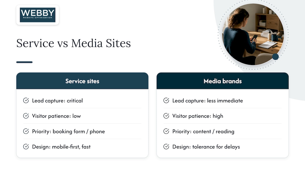
Faster, mobile-first pages tend to capture leads before a visitor gives up and calls a competitor instead, which matters more for a plumber or physiotherapist’s site than for a media brand with unlimited patience from readers. Webby Website Optimisation applies the same patterns covered above when rebuilding local service sites, prioritizing the booking form or phone number the way Airbnb prioritizes its calendar. If you want to see how this plays out in practice, our case studies walk through real rebuilds.
6. Why most mobile-first advice misses the point
Most articles on this topic treat mobile-first as a visual style: a hamburger menu, a stacked layout, done. That’s backwards. The examples that actually convert, Orange, T-Mobile, Airbnb, treat mobile-first as a sequencing discipline for content and performance, not a look. The layout is a side effect of deciding what matters most on a small screen with a slow connection.
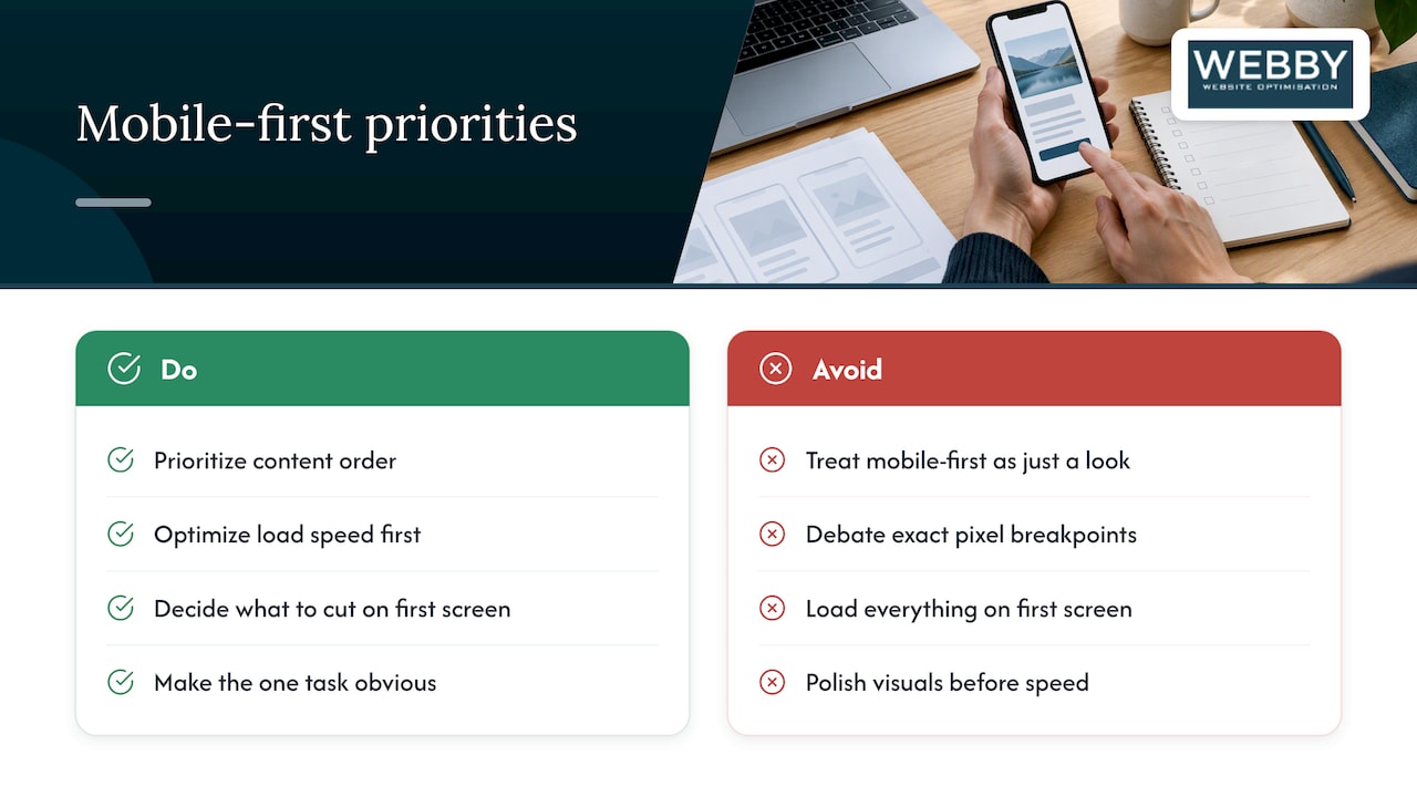
The overrated part of the conversation is breakpoints. Designers spend disproportionate time debating exact pixel values when the real work is deciding what to cut from the first screen. A page that loads fast with three things on it will usually outperform a page that loads slowly with everything.
If you take one thing from this article, prioritize content order and load speed before you touch visual polish. Skeleton loaders and progressive disclosure are worth adding later. Getting the first screen right, with the one task your visitor came for, is worth doing before anything else.
— Steve Doig
How Webby can help you put this into practice
Applying these patterns to a live business site usually means fixing what’s already there rather than starting from scratch, and that’s where a focused audit pays off faster than a full rebuild. Webby Website Optimisation offers a few paths depending on how much needs fixing:
- A Website Audit identifies specific mobile UX and performance issues on your current site.
- Website Built in a Day delivers a fast, hands-on rebuild for businesses that need mobile-first fixes without a long project timeline.
- Ongoing WordPress help and support keeps mobile-first improvements maintained once they’re live.

If your site is losing mobile visitors before they convert, start with the Website Audit to get a prioritized list of what to fix first.
Sources
FAQ
What does mobile-first design mean?
Mobile-first design means starting the layout and content decisions at a small screen, typically 320 to 375px, then adding complexity for larger viewports using min-width media queries. It’s a sequencing discipline, not just a visual style, and it forces content prioritization from the outset.
What are some good examples of mobile app design?
Spotify’s persistent bottom playback bar, Airbnb’s pinned booking summary, and Dropbox’s tap-triggered action sheet are widely cited examples that keep core tasks reachable on a small screen. Each prioritizes one dominant action rather than spreading attention across a busy interface.
Is mobile-first still relevant?
Yes. Mobile-first remains the standard approach because it improves performance on slow connections and low-end devices, not only on the newest phones, and major case studies continue to show measurable conversion gains from mobile-first rebuilds.
What are some examples of UI patterns used in mobile-first design?
Common patterns include single-column layouts, persistent bottom navigation, prominent primary calls-to-action, visible search bars, optimized images, and skeleton loaders during page load. Each pattern addresses a specific mobile constraint, whether that’s screen size, bandwidth, or touch ergonomics.