

Your contact page is the final conversion point on your website, and poor design at that stage costs businesses real leads every day. 51% of visitors cite missing contact details as the top barrier to engagement. That single stat explains why contact page design matters more than most website owners realize. A visitor who reaches your contact page is already interested. Bad design is the only thing standing between you and that lead.
Why contact page design matters for trust and lead generation
Contact page design is the discipline of structuring your contact page to reduce friction, build trust, and guide visitors toward submitting their information. The industry term for this practice is conversion-focused UX design, and it applies directly to contact pages just as it does to checkout flows and landing pages.
The business cost of getting this wrong is significant. Poorly designed contact pages cause an average loss of $47,000 per lost lead in B2B services. That figure reflects what happens when a qualified prospect hits a confusing form, finds no phone number, or sees a page that looks nothing like the rest of the site.

Trust signals are the foundation of a high-performing contact page. Showing human faces and names builds credibility and increases the likelihood a visitor will submit their details. A photo of a real team member, a first name, and a direct email address all communicate that a real person will respond. Generic stock photos and “info@” addresses do the opposite.
Microcopy also plays a larger role than most owners expect. The text on and around your submit button shapes how a visitor feels about clicking it. Replacing “Submit” with phrases like “Schedule your discovery call” reduces perceived commitment and lowers anxiety. That single word change can lift submission rates without touching the form structure at all.
Pro Tip: Align the headline on your contact page with the CTA text the visitor clicked to get there. If your service page says “Get a free quote,” your contact page headline should echo that exact promise. CTA and headline alignment prevents visitor confusion and directly boosts conversions.
Key trust signals to include on your contact page:
- A real team member’s name and photo
- A physical address or service area
- A response time promise (for example, “We respond within one business day”)
- Consistent branding that matches the rest of your site
- A phone number visible without scrolling
What are the best practices for contact form design?
The form itself is where most contact pages lose leads. The rule is simple: fewer fields convert better. Forms with 3–5 fields have the highest conversion rates, reaching around 25%. Every field you add beyond that creates another reason for a visitor to abandon the page.
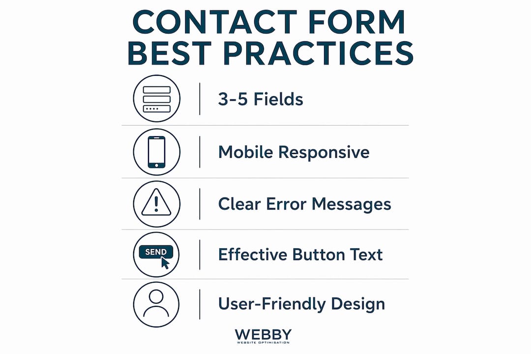
The math is unforgiving. Each extra form field reduces completion rates by 10–20%. Forms exceeding 10 fields see abandonment rates above 70%. That means a 12-field form loses more than seven out of every ten people who start filling it in.
Recommended form structure
Follow this order when building your contact form:
- Name (first name only is enough for most service businesses)
- Email address (required, with clear format validation)
- Phone number (optional unless your workflow requires it)
- Message or inquiry type (a short text field or dropdown)
- Submit button (with specific, low-commitment phrasing)
Mobile responsiveness is not optional. More than half of web traffic now comes from mobile devices, and a form that requires pinching, zooming, or fighting with tiny input fields will lose those visitors immediately. Fields should be large enough to tap, labels should sit above inputs rather than inside them, and the keyboard should auto-switch to the correct type (numeric for phone, email for address fields).
Error messages matter as much as the form itself. Vague errors like “Invalid input” frustrate users and cause abandonment. Specific messages like “Please enter a valid email address” tell the visitor exactly what to fix. Keyboard navigation support also matters for accessibility, and it signals to search engines that your site meets modern usability standards.
Pro Tip: Use a dropdown for “How did you hear about us?” only if you genuinely use that data. If it sits in a spreadsheet no one reads, remove it. Every optional field you cut is a friction point eliminated. Learning how to improve conversion rates on your pages starts with removing what does not earn its place.
| Form element | Best practice |
|---|---|
| Field count | 3–5 fields for highest completion |
| Button text | Specific action phrase, not “Submit” |
| Error messages | Specific and instructional |
| Mobile layout | Large tap targets, labels above fields |
| Optional fields | Remove unless data is actively used |
What additional elements improve contact page UX?
A well-designed form is necessary but not sufficient. The page around the form shapes the visitor’s confidence before they type a single character.
Multiple contact methods meet different user preferences and reduce friction from single-channel frustration. Some visitors prefer to call. Others want to send an email directly. A growing segment expects a live chat option. Offering all three does not complicate the page. It removes the excuse for not reaching out.
Response time expectations directly affect submission rates. Stating “We typically respond within one business day” builds lead trust by removing the anxiety of not knowing what happens after the form is submitted. This single line of text costs nothing to add and measurably reduces drop-off.
Additional elements that reduce friction and increase conversions:
- FAQs or self-service links: Including FAQs on contact pages reduces support load and improves user satisfaction by answering common questions before they become barriers.
- Map or service area: A Google Maps embed or a clear service area description confirms you operate where the visitor needs you.
- Social proof near the form: A short testimonial or a trust badge placed close to the submit button reinforces the decision to reach out.
- Privacy reassurance: A single line like “We never share your details” reduces hesitation from visitors worried about spam.
Branding consistency across the contact page is often overlooked. A visitor who clicks through from a polished service page and lands on a contact page with different fonts, colors, or a generic template loses confidence in the business. The contact page should look and feel like the rest of your site, not like an afterthought.
The website conversion funnel treats the contact page as the final stage of a deliberate sequence. Every element on the page should serve one goal: getting the visitor to submit their information with confidence.
How does a contact page affect SEO and legal compliance?
A contact page is a trust signal for search engines, not just for visitors. Contact page information is a critical SEO trust signal supporting Google’s E-E-A-T (Experience, Expertise, Authoritativeness, and Trustworthiness) guidelines. Google uses these guidelines to assess whether a website represents a legitimate, accountable business.
NAP consistency is the specific mechanism. NAP stands for Name, Address, and Phone number. When your contact page displays NAP information that matches your Google Business Profile and other directory listings, search engines treat your site as a verified entity. Inconsistencies across these sources weaken your local search authority and can suppress your rankings.
Legal compliance adds another layer of necessity. Most jurisdictions require businesses operating online to display verifiable contact information. In Australia, the Australian Consumer Law mandates that businesses provide a physical or registered address and a means of contact. Failing to include this information exposes a business to regulatory risk and erodes visitor trust simultaneously.
The SEO and legal case for a complete contact page reinforces the UX case. A page that satisfies Google’s E-E-A-T requirements, displays consistent NAP data, and meets legal transparency standards also happens to be the kind of page visitors trust. The role of page structure in generating leads extends directly to your contact page, where structure and credibility work together.
Key Takeaways
A well-designed contact page reduces friction, builds trust, and converts more visitors into leads by combining clear forms, human elements, and consistent branding.
| Point | Details |
|---|---|
| Form length is critical | Keep forms to 3–5 fields; each extra field cuts completion rates by 10–20%. |
| Trust signals convert | Real names, photos, and response time promises increase submission rates. |
| Button text changes behavior | Specific phrases like “Schedule your call” outperform generic “Submit” labels. |
| SEO depends on contact pages | Consistent NAP data and E-E-A-T signals improve local search authority. |
| Multiple contact methods reduce friction | Offering phone, email, and chat removes single-channel abandonment. |
The mistake I see on almost every contact page
Most website owners treat their contact page like a digital business card. They add a form, drop in an email address, and move on. That approach misses the point entirely.
The contact page is the highest-stakes page on your site. A visitor who reaches it has already decided they might want to work with you. Your only job at that point is to not get in their way. Yet most contact pages do exactly that. They ask for too much information, use vague button text, offer no reassurance about what happens next, and look like they were built in 20 minutes.
The checkout funnel analogy is the most useful frame I have found. No e-commerce business would let a customer reach the payment page and then present them with a confusing, slow, or untrustworthy experience. The same logic applies to a service business contact page. Friction at the final step is the most expensive friction on your site.
The detail that surprises most owners is how much microcopy matters. Changing one button label, adding one line about response time, or placing one real photo next to the form can shift submission rates noticeably. These are not design overhauls. They are small, deliberate choices that signal to the visitor that a real, responsive business is on the other side. Crafting effective CTAs is a skill, and the contact page is where that skill pays off most directly.
My honest advice: audit your contact page the way you would audit a checkout page. Time how long it takes to complete the form on a phone. Read the button text out loud. Ask yourself whether a first-time visitor would feel confident or uncertain. The answers will tell you exactly what to fix.
— Steve Doig
How Webby Website Optimisation can rebuild your contact page for results
A contact page that loses leads is a fixable problem, and the fix does not require a full site rebuild.
Webby Website Optimisation works with local service businesses in Perth, Fremantle, and Melville to design websites that convert visitors into real inquiries. The team builds contact pages with the right form structure, trust signals, and mobile-ready layouts that reflect your brand and meet Google’s quality standards. If your current contact page is underperforming, the website design and development service covers everything from form architecture to page layout and branding consistency. Businesses that want results faster can also explore a website built in a day to get a fully functional, conversion-ready site without a long wait.
FAQ
Why does contact page design matter for conversions?
Contact page design matters because it is the final step between a visitor’s interest and a submitted lead. Poor design, missing contact details, or long forms cause visitors to abandon the page before reaching out.
How many fields should a contact form have?
A contact form should have 3–5 fields. Forms with more than 10 fields see abandonment rates above 70%, while shorter forms consistently achieve higher completion rates.
What trust signals should a contact page include?
A contact page should include a real team member’s name and photo, a response time promise, a physical address or service area, and branding that matches the rest of the site.
How does a contact page affect local SEO?
A contact page with consistent NAP (Name, Address, Phone) information supports Google’s E-E-A-T guidelines and strengthens local search authority by confirming your business is a verified, accountable entity.
What is the best button text for a contact form?
Specific, low-commitment phrases like “Schedule your discovery call” or “Send your question” outperform generic labels like “Submit” by reducing visitor anxiety and clarifying what happens next.
Recommended
- Turn Website Visitors Into Leads: A Local Service Guide
- The Role of Service Page Structure in Getting Leads
If this post raised some questions feel free to ask me a question