
The top reasons your website visitors don’t convert
Most websites have a conversion problem, not a traffic problem. On average, only 1.7% of website visitors across all industries convert, which means the other 98.3% leave without taking action. Before you spend another dollar on ads or SEO, it’s worth understanding exactly why that’s happening.
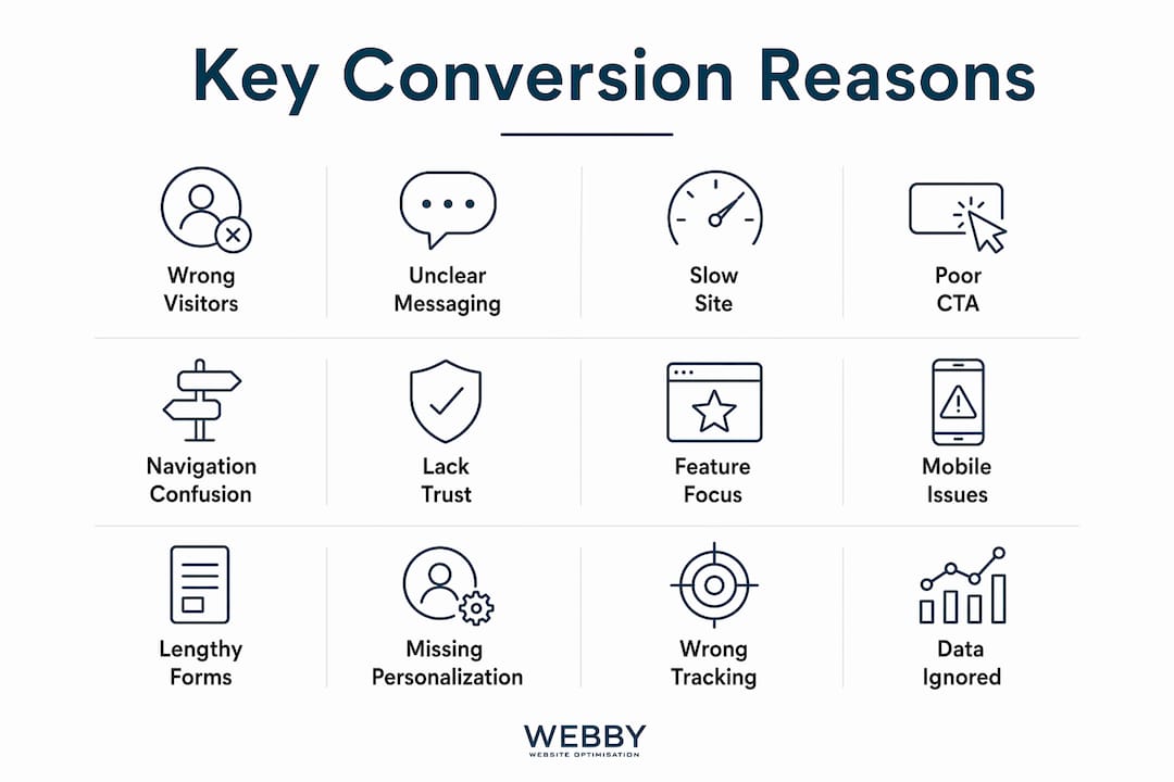
The most common culprits:
- Misaligned traffic: Visitors arrive with no buying intent because your ads or keywords attract the wrong audience.
- Unclear positioning: Visitors can’t figure out what you offer or who it’s for within the first five seconds, so they leave.
- Slow load times: Every extra second of load time costs roughly 7% in conversions, and 53% of mobile visitors abandon pages that take longer than three seconds.
- Weak or buried CTAs: A button that says “Submit” or sits below the fold doesn’t motivate anyone to click.
- Missing trust signals: 59% of consumers default to distrusting brands until trust is proven.
- Poor mobile experience: Mobile conversion rates are typically 40% to 60% lower than desktop due to poor user experience, slow loading, and navigation issues.
- Form friction: Every extra field you add to a form can reduce completion rates by approximately 4%.
These issues rarely appear alone. Most sites have two to four of them running simultaneously, which is why patching one thing rarely moves the needle.
Table of Contents
- Do you actually know who your visitors are and what they want?
- How site speed is quietly killing your conversions
- Your messaging probably isn’t as clear as you think it is
- 1. Your CTA doesn’t give visitors a reason to click
- 2. Navigation confusion sends visitors to your competitors
- 3. Visitors don’t trust you yet
- 4. Your content talks about features, not outcomes
- 5. Mobile visitors are hitting a wall
- 6. Your forms are asking too much, too soon
- 7. Personalization can close the gap between browsing and buying
- 8. You’re not tracking the right things
- What the data says about visitor behavior in 2026
- Key Takeaways
- Webby Website Optimisation turns browsers into buyers
Do you actually know who your visitors are and what they want?
Getting traffic is one thing. Getting the right traffic is another entirely. If your visitors don’t match your offer, no amount of design polish or copywriting will fix your conversion rate.
Start by identifying where your visitors are in the decision-making process. Someone searching “what is CRM software” is nowhere near ready to buy. Someone searching “CRM software for plumbing contractors” is much closer. The same page can convert at 1% from one source and 8% from another, purely based on intent alignment.
B2B buying is complex, often involving multiple stakeholders each doing their own anonymous research at different stages. The economic buyer rarely fills out a form. They read, compare, and disappear. That’s not a failure of your page; it’s a structural reality of how B2B decisions get made.
What this means practically:
- Audit your traffic sources in GA4. Break down bounce rate by channel. If paid traffic has a much higher bounce rate compared to organic traffic, the problem is targeting, not the page.
- Check your search queries in Google Search Console. If visitors are searching “affordable web design Perth” and your headline says “Digital solutions for growth,” you have a message mismatch.
- Match keywords to intent. Broad keywords attract broad audiences. Tighten your targeting to terms that signal purchase readiness.
- Recognize anonymous research behavior. Modern buyers, especially in B2B, prefer self-service research without filling out forms. A majority of a B2B buyer’s journey happens anonymously online.
The “Wrong Room” problem is real: sending the wrong visitors to your page wastes ad spend and skews your conversion data, making it harder to diagnose what’s actually broken.
How site speed is quietly killing your conversions
Speed is not a technical nicety. It’s a conversion factor. Google’s research shows that 53% of mobile visitors abandon a page that takes longer than three seconds to load, and each additional second of delay costs roughly 7% in conversions.

The most common speed killers are uncompressed images, excessive third-party scripts (think chat widgets, ad pixels, and analytics tags stacked on top of each other), and render-blocking JavaScript that forces the browser to pause before displaying anything. None of these are exotic problems. They show up on almost every site that hasn’t been audited recently.
Here’s a practical checklist:
- Run Google PageSpeed Insights on your key landing pages. Focus on Core Web Vitals: Largest Contentful Paint (LCP), Cumulative Layout Shift (CLS), and Interaction to Next Paint (INP).
- Compress images before uploading. Tools like Squoosh or ShortPixel cut file sizes dramatically without visible quality loss.
- Audit third-party scripts. Every tag you add slows the page. Remove anything you’re not actively using.
- Check SSL certificates. An expired SSL triggers browser warnings that stop visitors cold.
- Test across devices and browsers. A page that loads fine on Chrome desktop can break on Safari mobile.
Mobile speed deserves special attention. Over 63% of web traffic now comes from mobile devices, yet most businesses optimize for desktop first. If your mobile pages are slow or broken, you’re losing the majority of your potential conversions before they even see your offer.
Your messaging probably isn’t as clear as you think it is
Positioning is the most overlooked conversion problem. Visitors decide within five seconds whether your site is relevant to them, based almost entirely on what they read above the fold. If that section doesn’t answer three questions clearly, they’re gone: What do you do? Who is it for? Why should I choose you?

Most sites fail this test. Founders and marketers know their product so well they skip the basics, writing headlines like “Empowering businesses to reach their potential” when they should say “WordPress websites for Perth trade businesses, built in five days.” The first sounds polished. The second converts.
Concrete positioning beats abstract positioning every time. Naming your audience (“for HVAC contractors,” “for boutique law firms”) increases relevance for the right visitors and filters out the wrong ones. Specifying your differentiation, whether that’s speed, specialization, price, or a guarantee, gives visitors a reason to stay.
Pro Tip: Don’t guess whether your messaging is clear. Use session recordings in tools like Hotjar or Microsoft Clarity to watch where visitors scroll, click, and drop off. Heatmaps show you exactly which parts of your page get attention and which get ignored. Objective behavioral data beats any internal opinion about what “looks good.”
1. Your CTA doesn’t give visitors a reason to click
A call-to-action is where intent becomes action, and most CTAs actively undermine that moment. “Submit,” “Get Started,” and “Learn More” are the three most common CTA phrases on the web, and they all share the same flaw: they tell visitors nothing about what happens next.
Effective CTAs are specific and benefit-driven. “Get My Free Website Audit” outperforms “Contact Us” because it names the outcome. “Book a 15-Minute Call” outperforms “Schedule” because it reduces the perceived commitment. The importance of strong, well-placed CTAs to conversion rates is well-documented, yet most small business sites still use generic button text.
Key principles for CTAs that actually work:
- Place the primary CTA above the fold. If visitors have to scroll to find it, most won’t.
- Use one primary CTA per page. Multiple competing actions create decision paralysis.
- Match the CTA to the traffic source. Cold social traffic needs a lower-commitment offer (“Download the Free Guide”) than warm search traffic (“Get a Quote”).
- Add trust elements nearby. A line like “No credit card required” or “Free, no obligation” directly below the button removes hesitation.
- Avoid asking for too much upfront. Requesting a phone number, company size, and budget before a visitor has seen any value is a conversion killer.
2. Navigation confusion sends visitors to your competitors
When visitors can’t find what they’re looking for within a few clicks, they don’t ask for help. They leave. Navigation that’s cluttered, inconsistently labeled, or built around your internal company structure rather than visitor needs is a silent conversion killer.
The fix isn’t complicated, but it requires discipline:
- Limit main navigation to 5–7 items. Every extra option dilutes attention and increases cognitive load.
- Label items by what visitors call them, not what your team calls them internally. “Services” is fine. “Solutions Portfolio” is not.
- Add breadcrumbs on deeper pages so visitors always know where they are and can backtrack easily.
- Include a search bar on content-heavy sites. Visitors who use site search convert at significantly higher rates than those who don’t.
- Design for thumbs on mobile. Buttons need to be large enough to tap without zooming, and popups that cover content on mobile are a fast path to a bounce.
Reducing the number of choices on any given page also matters. Every competing CTA, sidebar link, or pop-up you add is another exit ramp. The best-converting pages are focused: one goal, one primary action, minimal distraction.
3. Visitors don’t trust you yet
Trust is not optional. 59% of consumers default to distrusting brands until trust is proven, and that skepticism is even higher for small businesses without household-name recognition. Visitors are asking themselves, consciously or not: “Is this real? Has anyone else used this? What happens if it doesn’t work?”
Your site needs to answer those questions before visitors ask them out loud.
Effective trust signals include:
- Specific testimonials with names, companies, and measurable outcomes. “We went from 12 leads a month to 47” beats “Great service!” by a wide margin.
- Case studies that walk through a real client problem and the result you delivered.
- Industry logos and certifications relevant to your visitors’ segment.
- Security badges near forms and checkout pages.
- Transparent contact information. A physical address, phone number, and real team photos signal legitimacy.
- FAQs that address common objections directly, rather than leaving visitors to wonder.
Placement matters as much as content. Testimonials buried at the bottom of the page, after the CTA, help no one. The visitor who needed reassurance already left. Put your strongest proof point near the top, adjacent to your primary CTA.
4. Your content talks about features, not outcomes
Visitors don’t buy features. They buy results. A plumber doesn’t want “advanced pipe diagnostics technology.” They want to stop losing jobs to blocked drains they can’t diagnose fast enough. The distinction sounds obvious, but the majority of small business websites lead with what they do rather than what the visitor gets.
Outcome-focused content requires knowing your audience’s actual pain points, which means doing real research. Talk to your best customers. Read your reviews. Look at the questions people ask in your industry forums. Then write copy that speaks directly to those problems.
A few practical shifts:
- Rewrite feature-led headlines as outcome statements. “Cloud-based scheduling software” becomes “Stop double-booking jobs and losing clients.”
- Lead with the problem, then introduce your solution as the answer.
- Use the language your customers use, not industry jargon. If your customers say “my website isn’t showing up on Google,” don’t write “organic search visibility optimization.”
- Provide resources that help visitors decide. Comparison guides, FAQs, and pricing transparency all reduce the friction of the decision-making process.
5. Mobile visitors are hitting a wall
Mobile traffic accounts for the majority of all web traffic, yet mobile conversion rates tend to be lower than desktop on sites with poor mobile UX. That gap isn’t about screen size. It’s about experience.
Common mobile problems that kill conversions:
- Small tap targets that require pinch-zooming to click accurately.
- Popups that cover the entire screen and are difficult to close on a phone.
- Horizontal scrolling caused by elements wider than the viewport.
- Forms with too many fields that are painful to fill out on a keyboard.
- Slow load times on cellular connections, compounded by unoptimized images.
Test your site on an actual phone, not just a browser’s responsive preview. The experience is often meaningfully different. Google’s Mobile-Friendly Test and PageSpeed Insights both flag specific mobile issues with actionable recommendations.
6. Your forms are asking too much, too soon
Forms are the final step before a conversion, which makes them the most dangerous place to lose someone. Every extra field you add can reduce form completion rates by approximately 4%. A five-field form converts better than a ten-field form, almost without exception.
Progressive profiling is the smarter approach. Collect the minimum information needed for the first interaction, then gather more over subsequent touchpoints. For a free consultation request, you need a name, email, and one qualifying question. You don’t need company size, annual revenue, and a project description before you’ve even spoken to the person.
Multi-step forms also outperform single long forms. Breaking a form into two or three steps makes it feel less daunting, and once someone completes step one, they’re more likely to finish. The psychological principle here is commitment and consistency: small yeses lead to bigger yeses.
Leads contacted very shortly after form submission are significantly more likely to convert than those contacted later, while average B2B response times tend to be quite long. If your form submissions sit in an inbox until Monday morning, you’re losing the majority of your qualified leads before you’ve said a word.
7. Personalization can close the gap between browsing and buying
Generic messaging converts generically. When a visitor from a Google ad for “SEO for dentists” lands on a homepage that talks about “digital marketing for all businesses,” the relevance gap is immediate and costly. Personalization closes that gap by matching the message to the visitor’s context.
At the simplest level, this means using dynamic landing pages that reflect the ad or keyword that brought the visitor there. At a more sophisticated level, it means showing different content to returning visitors versus first-timers, or to visitors from specific industries or geographies.
Personalization doesn’t require enterprise-level tools. Even basic segmentation, such as separate landing pages for different service lines or audience types, produces measurable conversion lifts. The goal is to make every visitor feel like the page was written for them specifically, because the closer that’s true, the more likely they are to act.
8. You’re not tracking the right things
Most small business owners track pageviews and overall traffic. Neither of those metrics tells you why visitors don’t convert. The metrics that actually matter are the ones that reveal where visitors drop off and why.
Key metrics to monitor:
| Metric | What it tells you |
|---|---|
| Bounce rate by traffic source | Whether your traffic quality matches your offer |
| Scroll depth | How far visitors read before leaving |
| Exit pages | Which pages are losing visitors before conversion |
| Form abandonment rate | Where in the form process visitors give up |
| Micro-conversion rate | Whether visitors take small steps (video views, downloads) before the main conversion |
| Session recordings | The exact path and behavior of individual visitors |
| Heatmaps | Which page elements get attention and which are ignored |
Multi-touch attribution models give a more accurate picture of how different channels contribute to conversions. Last-click attribution, the default in many analytics setups, gives all the credit to the final touchpoint and hides the real influence of earlier interactions. That leads to budget decisions that cut channels that were actually doing important work.
A/B testing is the mechanism that turns data into improvement. Test one variable at a time: a headline, a CTA, a hero image, a form length. Run tests long enough to reach statistical significance before drawing conclusions. Small, consistent improvements compound over time. You can learn more about measuring your marketing to build a cleaner picture of what’s actually driving results.
What the data says about visitor behavior in 2026
The most important shift in visitor behavior over the past few years is the move toward anonymous self-service research. Buyers, particularly in B2B, do not want to fill out a form to get information. They want to research on their own terms, compare options without being followed up by a sales rep, and make decisions before they ever identify themselves.
This creates a structural problem for businesses that rely entirely on form fills to measure interest. Visitor identification tools can passively capture intent from the 97% of anonymous visitors who never fill out a form, and using identity graph technology can increase identified leads by up to 15 times compared to form fills alone.
Pro Tip: Don’t wait for visitors to raise their hand. Complement your contact forms with passive identification tools that capture behavioral signals from anonymous visitors. This is especially valuable for B2B businesses where the economic buyer rarely fills out a form but does spend significant time on your pricing and case study pages.
The positioning insight is equally important. Visitors decide within five seconds whether your site is relevant, based on what they see above the fold. That’s not a design problem. It’s a messaging problem. Most sites fail this test not because they look bad, but because their headline is too vague, their audience is too broad, or their differentiation is buried three paragraphs down. You can explore how to improve conversion rates on your key pages as a starting point for fixing this.
Key Takeaways
Most website conversion failures come down to three root causes: the wrong visitors arriving, unclear messaging above the fold, and insufficient trust signals. Fixing all three simultaneously produces results that fixing one alone rarely does.
| Point | Details |
|---|---|
| Speed directly affects revenue | Each additional second of load time costs roughly 7% in conversions; mobile pages must load in under three seconds. |
| Positioning decides in five seconds | Visitors leave if your headline doesn’t answer what you do, who it’s for, and why choose you above the fold. |
| Trust signals need placement, not just presence | Testimonials and proof points must appear near your CTA, not buried at the bottom of the page. |
| Form length controls completion rates | Every extra field reduces form completion by approximately 4%; collect only what you need for the first interaction. |
| Webby Website Optimisation | Webby Website Optimisation audits and rebuilds websites for small and medium businesses to fix the exact conversion gaps covered in this article. |
Webby Website Optimisation turns browsers into buyers
If your site is getting traffic but not leads, the gap between those two numbers is costing you real money every month. Webby Website Optimisation works with small and medium businesses to diagnose and fix the conversion problems that generic website builders and DIY tweaks miss: slow load times, unclear positioning, weak CTAs, broken mobile experiences, and the trust gaps that send visitors to your competitors instead.
The work is specific to your business, not a template applied to everyone. Webby Website Optimisation’s website design and development service is built around one goal: a site that converts the visitors you’re already paying to attract. That means clean architecture, fast load times, messaging that passes the five-second test, and conversion funnels built around how your actual customers make decisions.
If you want to know exactly what’s holding your site back, start with a free audit. Webby Website Optimisation will tell you what’s broken and what to fix first, without the guesswork.