

A responsive website is a site that automatically adjusts its layout, images, and content to fit any screen size, from a desktop monitor to a smartphone. The industry term for this approach is responsive web design (RWD), a standard first articulated by designer Ethan Marcotte in 2010 and now the baseline expectation for every professional site. 52% of users are less likely to engage with a company if its mobile experience is poor. That single statistic tells you everything about the stakes. If your site forces mobile visitors to pinch, zoom, or scroll sideways, you are actively pushing customers toward competitors.
What is a responsive website, technically speaking?
A responsive website uses three core technologies to adapt its layout in real time: media queries, flexible grids, and fluid images. Each plays a distinct role, and understanding them helps you have smarter conversations with developers and make better decisions about your site.

Media queries
Media queries are CSS instructions that tell a browser how to display content at different screen widths. Think of them as conditional rules: “If the screen is narrower than 768 pixels, stack these columns vertically.” They are the backbone of every responsive layout built in the last decade.
Fluid grids and relative units
Fixed pixel layouts break on screens they were not designed for. Fluid grids replace fixed pixel measurements with relative units like percentages and em values. A column set to 50% of its container will always take up half the available width, whether the screen is 320 pixels wide or 1,920 pixels wide. This flexibility is what separates a truly responsive site from one that just looks acceptable on a phone.
Flexible images and media
Images set to a maximum width of 100% scale down automatically within their containers. Without this rule, a large hero image will overflow its column on a small screen and break the entire layout. Flexible media is a small technical detail with a large visual impact.
Beyond the basics: container queries
Modern responsive design goes further than viewport-based media queries. Container queries allow individual components to adapt based on the size of their parent element, not the overall screen. This matters when you have a sidebar widget or a product card that needs to reflow independently of the page layout. Combined with CSS clamp() for fluid typography and CSS Grid for sophisticated layouts, container queries represent the current state of the art in 2026.
Pro Tip: Ask your developer whether your site uses container queries alongside media queries. If they look blank, your site may be running on 2015-era responsive techniques that will struggle with modern component-based designs.
What are the primary benefits of a responsive website for your business?
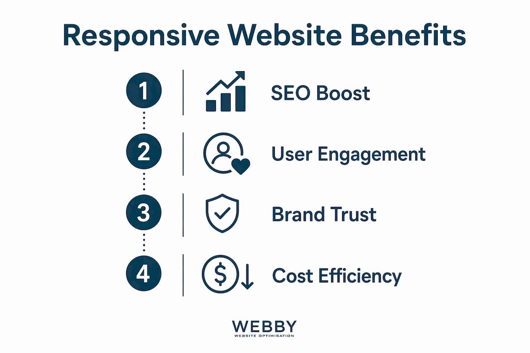
The benefits of responsive websites go well beyond aesthetics. They affect your Google rankings, your conversion rate, and how potential clients perceive your brand.
SEO and Google’s mobile-first indexing
Responsive design directly boosts SEO because Google uses mobile-first indexing, meaning it crawls and ranks the mobile version of your site first. A site that performs poorly on mobile will rank lower across all devices, not just phones. For a local service business in Perth or Fremantle competing for page-one visibility, this is not a minor technical detail. It is a direct revenue factor.
Lower bounce rates and higher conversions
When visitors land on a site that works well on their device, they stay longer and take action more often. Businesses see increased conversions and customer trust after implementing responsive design because smoother mobile navigation removes friction from the purchase journey. A plumber in Melville whose contact form is easy to tap on a phone will get more calls than a competitor whose form requires a desktop to complete.
Trust and perceived professionalism
Non-responsive sites signal technical neglect, and enterprise buyers in particular will rule out vendors during technical evaluations if their site looks broken on a phone. Even for smaller service businesses, a site that renders poorly on mobile tells visitors the business does not pay attention to detail. That impression transfers directly to how they feel about your service quality. If you are unsure whether your site is sending the right signals, reviewing the signs your site needs a redesign is a practical first step.
Cost efficiency of a single site
Maintaining one responsive site costs far less than managing separate desktop and mobile versions. You update content once, run one SEO campaign, and track one analytics profile. For small and medium businesses with limited marketing budgets, that consolidation matters.
Responsive vs. adaptive vs. fixed: what is the difference?
These three terms describe fundamentally different approaches to building websites, and the distinctions have real consequences for your business.
Adaptive design serves fixed layouts for specific predetermined breakpoints, while responsive design uses fluid layouts that adapt continuously across all screen sizes. A fixed layout is built for one screen width and does not adapt at all.
| Approach | How it works | Main advantage | Main drawback |
|---|---|---|---|
| Responsive | Fluid layout adapts to any screen width | Future-proof, one codebase | Requires careful planning |
| Adaptive | Fixed layouts for set breakpoints | Precise control at each size | Misses screens between breakpoints |
| Fixed | Single static width | Simple to build | Breaks on most mobile screens |
Responsive design is the preferred approach for most businesses because it handles screen sizes that do not yet exist. New device form factors, from foldable phones to large-format tablets, will fall within a fluid layout’s range automatically. Adaptive and fixed sites require manual updates every time a new popular screen size emerges.
When responsive design is executed well, it becomes invisible. Users do not notice the site adapting. The experience simply feels natural on whatever device they are using. That invisibility is the goal.
How to create a responsive site: practical steps for business owners
You do not need to write a single line of code to make smart decisions about your site’s responsiveness. You do need to understand the process well enough to hold your developer accountable.
1. Start with mobile-first design
Mobile-first design means designing for the smallest screen first, then progressively adding complexity for larger viewports. This forces you to prioritize your most important content and calls to action. If something does not fit on a phone screen, it probably does not need to be there at all. For SME website design best practices, mobile-first is the starting point, not an afterthought.
2. Use a proven framework or modern CSS
Bootstrap remains the most widely used responsive framework, providing a grid system and pre-built components that handle most layout challenges. For custom builds, CSS Grid and Flexbox give developers precise control without the overhead of a full framework. Either approach works. The key is that your developer is not writing layout code from scratch without a system.
3. Test on real devices, not just emulators
Testing on actual devices at each breakpoint is the only reliable way to confirm your site works. Browser emulators show you how a layout looks, but they cannot replicate touch behavior, font rendering differences, or performance on a mid-range Android phone. Test on at least one iOS device, one Android device, and a tablet before launching any major design change.
4. Avoid these common pitfalls
- Tap targets too small: Buttons and links need to be at least 44 by 44 pixels to be tappable without frustration on a touchscreen.
- Text that does not reflow: Fixed-width text blocks that overflow their containers on small screens are a common oversight.
- Unoptimized images: Large image files that load slowly on mobile connections hurt both user experience and mobile load speed, which directly affects your Google rankings.
- Pop-ups that block content: Google penalizes intrusive interstitials on mobile. Full-screen pop-ups that appear immediately on a mobile visit are both a UX problem and an SEO risk.
5. Know when to bring in a professional
If your current site was built more than four years ago, it is likely running on a framework or theme that predates modern CSS techniques. A professional audit will tell you whether a few targeted fixes will do the job or whether a full rebuild is the smarter investment. The benefits of professional web design for local service businesses are well documented, particularly when responsiveness is paired with an SEO strategy from the start.
Pro Tip: Run your site through Google’s PageSpeed Insights and check the mobile score separately from the desktop score. A gap of more than 20 points between the two is a strong signal that your mobile responsiveness needs attention.
Key Takeaways
A responsive website is the single most important technical foundation for any business that wants to compete for online visibility and convert mobile visitors into customers.
| Point | Details |
|---|---|
| Responsive design definition | A site that uses fluid grids, media queries, and flexible images to adapt to any screen size. |
| SEO impact | Google’s mobile-first indexing means a non-responsive site ranks lower across all devices. |
| Business trust signal | Non-responsive sites are seen as outdated and can cause potential clients to rule out your business. |
| Mobile-first approach | Design for the smallest screen first, then scale up, to prioritize what matters most. |
| Test on real devices | Emulators miss touch behavior and performance issues that only appear on actual phones and tablets. |
Why I think most businesses still underestimate this
I have worked with dozens of local service businesses across Perth and the surrounding suburbs, and the pattern is consistent. Business owners know their site “should work on mobile,” but they check it once on their own phone, it looks fine, and they move on. The problem is that their phone is usually a recent flagship model with a fast connection. Their customers are often on older Android devices with slower processors and patchy 4G.
The gap between “looks okay on my iPhone 15” and “works well for my actual customer base” is where most mobile UX problems live. I have seen businesses lose significant lead volume simply because their contact form was broken on a specific Android browser version, and nobody caught it because testing was never systematic.
The other thing I consistently observe is that responsiveness and SEO are treated as separate projects. They are not. Google’s mobile-first indexing means your mobile site performance is your SEO performance. A business that invests in keyword research and content but ignores mobile load times and layout stability is building on a cracked foundation. Responsive design is not a design preference. It is infrastructure. Treat it that way, and the returns compound over time.
— Steve Doig
Get a responsive website that works for your business

Webby Website Optimisation builds responsive websites for local service businesses in Perth, Fremantle, and Melville that are designed to rank, load fast, and convert visitors into leads. Every site we deliver is built mobile-first, tested across real devices, and integrated with an SEO strategy from day one. If your current site is losing you leads because it does not perform on mobile, we can show you exactly where the gaps are. Get a free website audit and find out what a properly built responsive site could do for your business.
FAQ
What is the responsive design definition in simple terms?
Responsive web design is a development approach where a website’s layout automatically adjusts to fit the screen it is being viewed on, using fluid grids, media queries, and flexible images.
Does a responsive website improve my Google rankings?
Yes. Google uses mobile-first indexing, meaning it ranks the mobile version of your site first. A non-responsive site will rank lower across all devices, not just on phones.
What is the difference between responsive and adaptive design?
Responsive design uses fluid layouts that adapt continuously to any screen width. Adaptive design serves fixed layouts for specific predetermined breakpoints, which means it can miss screen sizes that fall between those points.
How do I know if my website is already responsive?
Open your site on a smartphone and resize your browser window on a desktop. If the layout reflows cleanly and all content remains readable without horizontal scrolling, your site is responsive. Google’s PageSpeed Insights also reports mobile usability issues directly.
What is mobile responsiveness and why does it matter for conversions?
Mobile responsiveness is the ability of a website to deliver a usable, readable experience on any mobile device. Businesses that implement responsive design see higher conversions because smoother mobile navigation removes friction from the path to purchase.
Recommended
- What Is a Sales-Ready Website? Your 2026 Guide
- SME Website Design Best Practices That Convert
- What Is a Website Audit? A Business Owner’s Guide
- Why WordPress Suits Small Businesses: 2026 Guide
If this post raised some questions feel free to ask me a question
Trackbacks/Pingbacks