
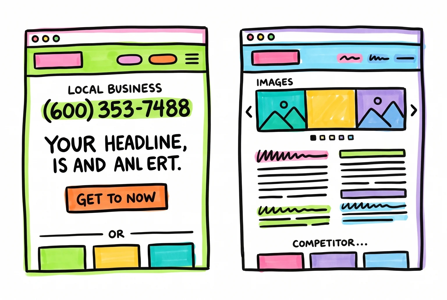
Website success is a numbers game, not a beauty contest
Does your website look good? Wrong question. Does it load fast, say something clear in the first few seconds, and give a visitor an obvious next step? Those are the questions that decide whether someone becomes a customer or closes the tab.
The average visitor gives a page 10 to 20 seconds to prove it’s worth staying on. Most site visits last under a minute total. On mobile, where most local searches happen, average load times run 8.6 seconds against 2.5 seconds on desktop, a gap of 70.9%. Google’s own research finds that 53% of mobile visitors abandon a page that takes more than 3 seconds to load. Push load time from 1 second to 3 to 5 seconds and bounce probability jumps 90%. Push it to 5 to 10 seconds and it jumps 123%.
None of that is about design taste. It’s measurable behaviour, and it’s the same behaviour whether the business is a plumber, a café, or an accounting firm. For a local service business, a landing page converting below 2% usually means the messaging, layout, or usability is doing the opposite of what it should.
[Image failed: Every extra second on mobile is a door closing before a visitor even sees what you do.]
This piece looks at two real patterns: a small business site built around clarity and speed, and one built around clutter and guesswork. Both show up constantly across local business websites. After that, we’ll break down the psychology behind why one wins trust and the other loses it, look at how the same patterns repeat across different industries, and finish with a checklist you can run against your own site today.
Inside a homepage that actually gets the phone ringing
Picture a Perth electrician’s homepage. Nothing fancy, just built with intent.
The top bar carries a phone number and “Servicing Perth Metro”, visible before the visitor scrolls at all. That single line answers two of the three questions a visitor asks in their first seconds on a local business site: what do you do, and do you serve my area. The third question, can I trust you, gets answered a few lines down.
HEADLINE: “Licensed Electrician, Same-Day Callouts Across Perth.” Not “Welcome to Sparks Electrical.” No mission statement, no clever tagline. The headline states the service and the location together, which is what local-service visitors are scanning for.
SUBHEADLINE: One line under it: “Fully licensed, fixed-price quotes, no callout surprises.” This does two jobs. It sets a price expectation and pre-empts the anxiety that stops people calling tradies, getting stung by an unclear invoice.
CTA: A single orange button, “Get a Free Quote,” sitting directly beneath the subheadline. Not “Submit.” Not “Learn More.” A four-word phrase describing the result the visitor gets. It’s the only button above the fold. No second competing CTA fighting for attention, because a visitor forced to choose between “Book Now” and “Contact Us” and “Get Quote” often chooses none of them.
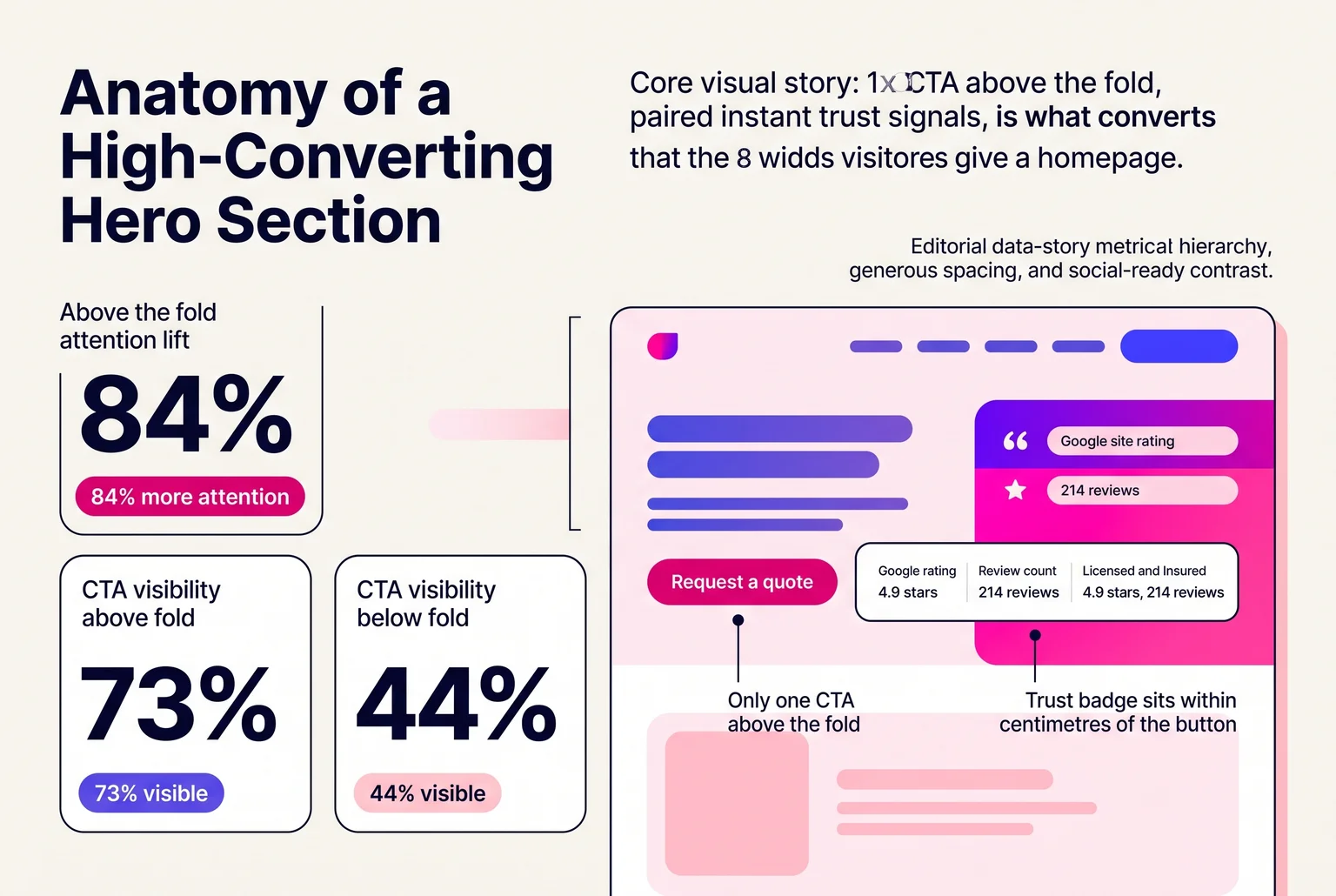
One button, one message, and trust signals close enough to touch: this is what an eight-second decision looks like on screen.
TRUST: Right beside the CTA sits a Google rating badge, 4.9 stars from 214 reviews, plus a small “Licensed and Insured” badge. That combination sits within a few centimetres of the button a visitor is about to click, so the reassurance lands at the exact moment of hesitation.
Scroll past the hero and there’s a strip of three trust markers: years in business, suburbs serviced, and a satisfaction guarantee. The CTA repeats after this section, and again after the testimonials block further down, worded slightly differently each time (“Request Your Quote”, “Check Availability”) so it never feels like a stuck banner.
On mobile, the CTA button is a full 56 pixels tall, easy to hit with a thumb, and tapping the phone number in the header launches a call immediately. No pinching, no zooming, no five-field contact form standing between a visitor and a booked job.
Load time sits around 1.8 seconds. The whole page is under 40 seconds to make one decision: click the button or leave.
Inside a homepage that quietly drives people away
Picture a different small business, a Perth carpet cleaning company, same industry category, same intent to get the phone ringing, but built without any of the intent from the electrician’s site.
The homepage opens with a rotating image slider, five slides cycling through logo, a stock photo of a smiling cleaner, a discount banner, a truck photo, and a Google Maps embed. Nothing sits still long enough to read. Above this sits a navigation bar with eleven menu items, including “Home”, “About Us”, “Our History”, “Services”, “Residential Services”, “Commercial Services”, and a dropdown three levels deep for “Carpet Types We Clean.” This kind of layout mirrors what shows up in write-ups of bad web design, sites like Arngren, dense with competing visual elements, or Pacific Northwest X-Ray, walls of text with no clear next step.
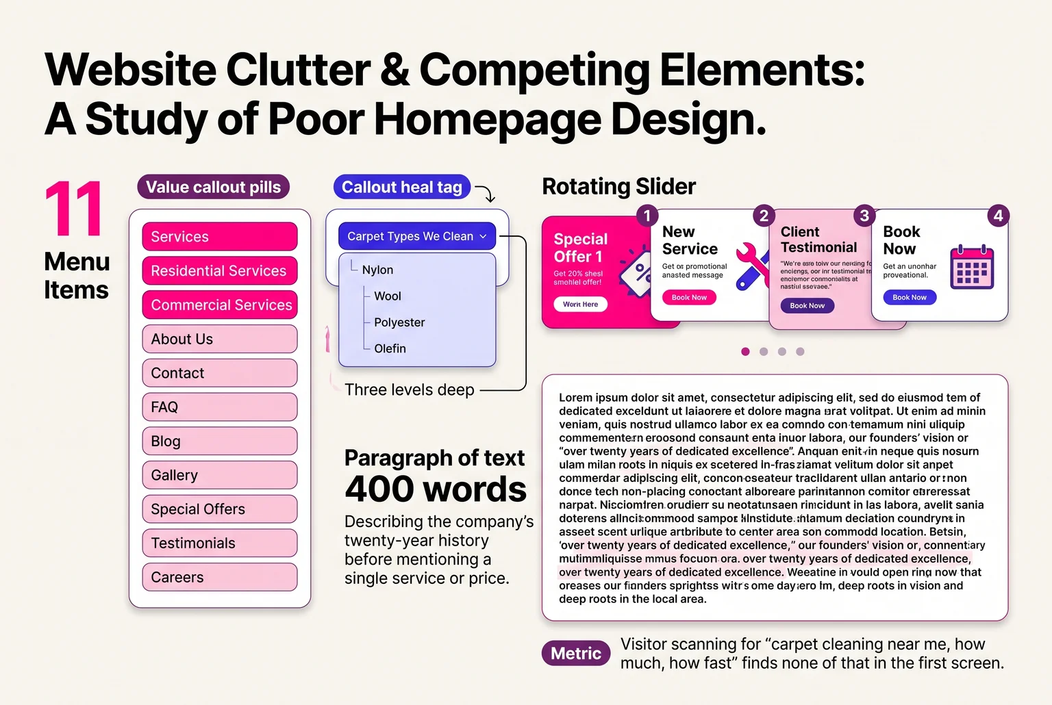
Below the slider is a paragraph of text, four hundred words, describing the company’s twenty-year history before mentioning a single service or price. No headline stating what the business does or where it operates. A visitor scanning for “carpet cleaning near me, how much, how fast” finds none of that in the first screen.
The page takes 6.4 seconds to load on mobile, measured on a standard 4G connection. Catchpoint’s research on site performance found that 53% of mobile visitors abandon a site that takes longer than three seconds to load, so more than half the people who tap through from a Google search never see the page at all.
For the ones who wait it out, the CTA problem starts. Three buttons sit in different spots on the page: “Contact Us,” “Get In Touch,” and “Book Online,” each leading to a different destination, one a contact form, one a phone number, one a broken link to a booking system that returns a 404 error. A Clutch survey found that 49% of consumers will leave a site over confusing navigation alone, and this page asks visitors to choose between three unclear actions before they’ve even been told what the service costs.
No Google rating badge, no review count, no licensing or insurance mention anywhere above the fold. The footer has a copyright date of 2019. Missing basic navigation clarity and trust markers like these is linked to 44% of visitors leaving a site immediately, and nothing on this page gives a hesitant visitor a reason to stay.
Why one site works and the other doesn’t
Both examples come down to the same handful of psychological triggers, applied or ignored.
Speed is the first one, and it’s not just about impatience. Users form an opinion of a site within 50 milliseconds, and that snap judgment includes an assessment of whether the business can be trusted. A 2026 study on load times found 75% of users trust fast websites more, linking quick loading to professionalism and reliability, while slow sites got tagged as less credible before a visitor read a word of copy. The electrician’s 2.5-second load time isn’t just convenient, it’s a credibility signal. The carpet cleaner’s 6.4-second load time tells a visitor the business doesn’t sweat the details, before they’ve seen a single testimonial.
Trust signals work the same way. A Google rating badge, a licensing mention, a physical service area stated plainly, these function as legitimacy markers that tell a stranger this is a real, accountable business. Their absence on the carpet cleaner’s page isn’t neutral, it reads as a gap the visitor’s brain fills with doubt.
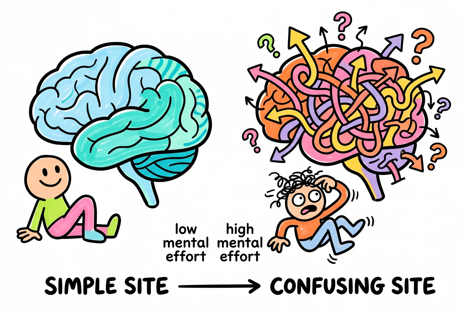
Then there’s cognitive load, the mental effort required to figure out what to do next. Simpler interfaces convert better because they ask less of the visitor’s brain. Websites with lower cognitive load can see conversion rates as much as 72% higher, and pages that let visitors find what they need in under three clicks can convert 61% better than ones that don’t. The eleven-item menu and three competing buttons on the carpet cleaner’s site force a decision-making process most visitors won’t bother finishing. Reducing that kind of unnecessary complexity has been shown to lift conversions by 10% to 30% across industries, largely by letting people focus on the one task they came to do.
The single orange CTA on the electrician’s homepage isn’t a design flourish, it’s a decision already made for the visitor. One action, one destination. The carpet cleaner’s three buttons pointing to three different places is a smaller version of the classic “jam study,” where cutting choices from 24 to 6 pushed purchase rates from 3% to 30%. More options don’t create more customers. They create more hesitation.
None of these principles need a marketing degree to apply. They all point the same direction: reduce the guessing, back up the claims, and get out of the visitor’s way.
The same failures show up in every industry
The tradie and carpet-cleaner examples aren’t outliers. Swap the industry and the same wins and losses turn up.
Cafés fail in a specific, common way: the menu is a PDF, or worse, a photo of a printed menu taken on someone’s phone. Search engines can’t read it, screen readers can’t read it, and on a small screen it means pinching and zooming to figure out if there’s a vegan option. Menus provided only as images create the same problem, blocking anyone trying to scan items and prices. The fix is boring but effective: an HTML menu, typed out as actual text, with categories and prices anyone can read in a browser tab. The cafés that get this right also put ordering and hours where visitors actually look, in the header or footer, on every page, not buried three clicks deep on a “Visit Us” subpage. A café whose “Order Online” button sits below a hero slideshow and a paragraph about its sourcing philosophy is asking customers to work for their lunch.
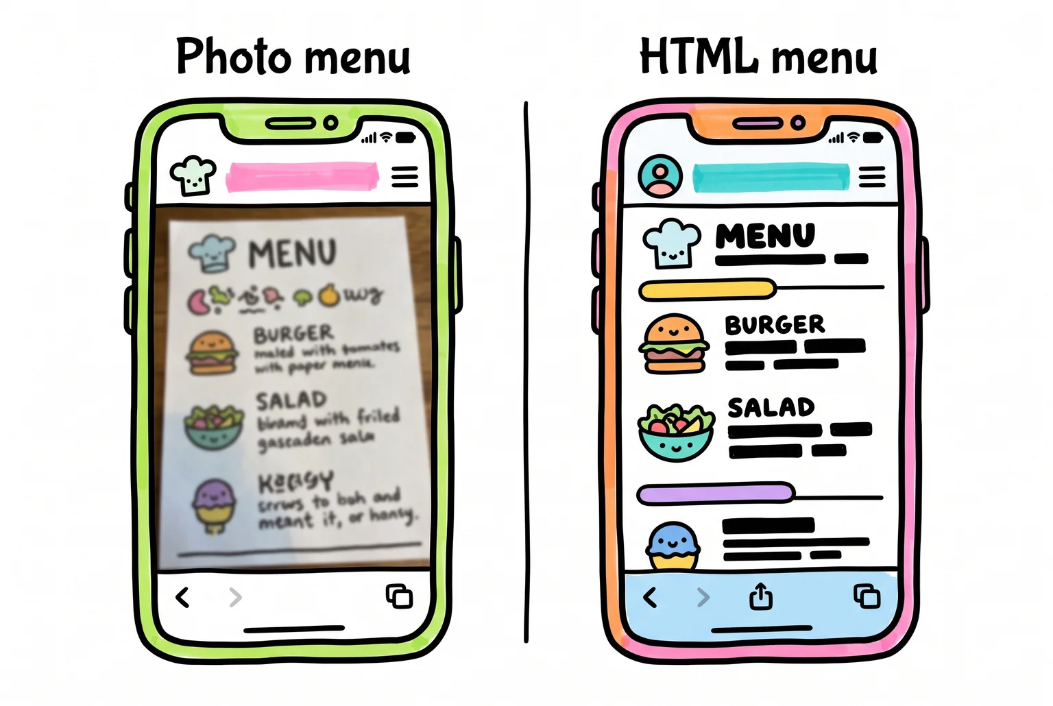
Trades follow the tradie pattern from earlier: click-to-call numbers, short booking forms, and a clear split between “emergency now” and “book a quote for next week.” A plumber whose only contact option is a generic form that dumps into an inbox nobody checks on weekends loses the exact customers who need them most urgently.
Professional services, like accounting firms, run on a different currency: credibility. Credentials such as CPA or CMA designations need to sit above the fold, not on an “About” page nobody visits. Testimonials need to be specific (“saved us $14,000 in the first audit”) rather than vague (“great to work with”). And the call to action should say something concrete, like “Get Your Free Business Tax Review,” instead of a flat “Contact Us.”
Different industries, same three questions: can people find what they came for, do they trust what they’re looking at, and is the next step obvious. That’s the pattern behind every checklist item that follows.
25-point audit: run this against your own site right now
Open your site on your phone and work through these one at a time.
- Load your homepage on mobile data and time it. Past 2.5 seconds, you’re losing visitors before they see anything.
- Check Core Web Vitals in PageSpeed Insights. Aim for LCP under 2.5 seconds, INP under 200 milliseconds, CLS under 0.1. A mobile score below 50 means fix this first.
- Read your headline without scrolling. Can a stranger tell what you do and where you’re located within five seconds?
- Count your primary CTAs above the fold. One clear action, not three competing buttons.
- Test every phone number as a tap-to-call link. Plain text means mobile visitors have to copy and paste it manually.
- Count your contact form fields. Each extra field costs roughly 4.1% of conversions on average; forms with more than five fields can lose 30% more submissions than shorter ones.
- Check if your form asks for a phone number when it doesn’t need to. That field alone can cause a 5% dip in completions.
- Break long forms into visual steps instead of one page. Multi-step forms convert 37% better than single long pages with the same fields.
- Look for at least one testimonial with a specific number or outcome, not just a vague compliment.
- Check your title tag. It should include your main keyword and your suburb or city.
- Check your meta description, H1, URL slug, and opening paragraph for that same keyword and location combination.
- Search your own navigation menu. More than seven or eight items usually means visitors can’t find anything fast.
- Click every internal link and check the anchor text. “Click here” tells search engines nothing; “get a free quote” does.
- Check your image file names and alt text. They should describe the image and include your keyword where it fits naturally, not as keyword stuffing.
- Test your contact page. Is your phone number, email, and address current and clickable?
- Look for a working 404 page instead of a dead end when a link breaks.
- Check whether your ad landing pages match your ad copy. Mismatched messaging kills paid traffic fast.
- Confirm analytics is actually tracking conversions, not just visits.
- Count clicks from homepage to your most important page. More than three, and you’re losing people.
- Check whether pop-ups block content on mobile before a visitor has read anything.
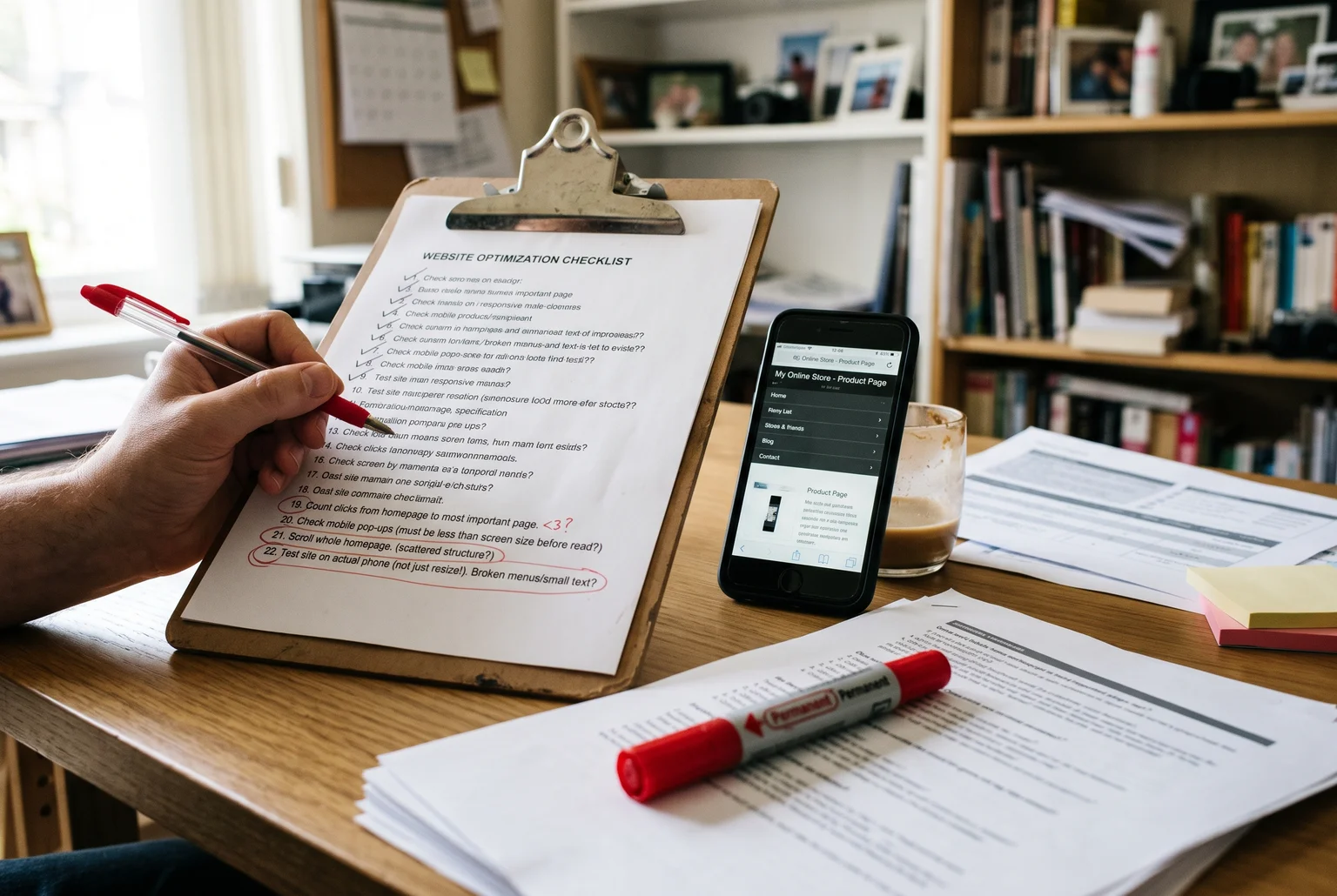
- Scroll your whole homepage. Past four or five screens with a scattered structure, visitors drop off before the message lands.
- Test your site on an actual phone, not just a browser resize. Broken menus and tiny tap targets show up differently in real conditions.
- Check your primary keyword appears in your first 100 words.
- Score every failed item by impact and effort, and fix the high-impact, low-effort ones first.
- Ask someone outside your business to find your phone number in under ten seconds. If they can’t, neither can your customers.
If your site failed most of these, here’s where to start
A long list of red circles on that audit sheet doesn’t mean your business is failing. It means your website hasn’t caught up to it. Some fixes are quick: rewrite a headline, shorten a form, add tap-to-call links. Others (page speed, technical SEO, Core Web Vitals) take tools and time most business owners don’t have spare.
If you’d rather hand it off than spend a weekend in your site’s back end, Webby Website Optimisation works through exactly this kind of repair and rebuild work for small businesses. Steve Doig runs it as a one-person operation out of Perth, which means you talk to the person doing the work.
Pick the highest-impact item on your list and start there today.