
Why your website might be turning people away
Picture someone landing on your homepage right now. Do they know what you do, who it’s for, and what to click within a few seconds? If you hesitated, that’s your answer.
Conversion rate optimisation is simply the practice of improving your website so more of the people already visiting it take action, whether that’s calling you, booking a job, or buying something. It’s not about chasing more traffic. It’s about getting more out of the visitors you already have.
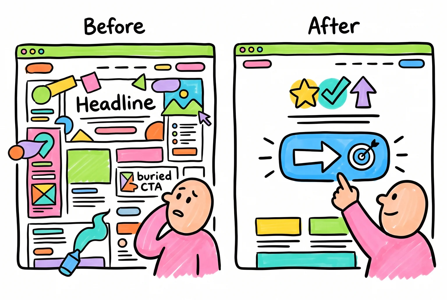
Most small business websites lose customers for the same handful of reasons: pages that load too slowly, especially on mobile, a homepage that doesn’t say clearly what you offer or who it’s for, buttons that don’t tell people what to do next, and forms or menus that make things harder than they need to be.
[Image failed: One of these homepages keeps visitors, the other loses them before they even scroll.]
This guide walks you through fixing that yourself: audit your site, prioritise what to fix, redesign with proven principles, and test the results. No specialist required.
Checklist: what to look for before you touch a thing
Before you change a single button or headline, look at what you’ve already got. Grab a notebook, open your site on both desktop and phone, and work through this list.
- The five-second test. Look at your homepage cold. Can you tell what the business does, who it’s for, and what to do next? If you have to think about it, visitors will fail this test too.
- Jargon and clutter check. Count how many different offers, messages, or industry terms are competing for attention. A homepage crowded with jargon or multiple offers loses people before they read a word of it.
- CTA visibility. Is there one clear button telling people what to do, visible without scrolling, and repeated further down the page?
- Mobile speed and usability. Load your site on your phone using mobile data, not wifi. Google’s own research found that 53% of mobile visits are abandoned once a page takes longer than three seconds to load.
- Trust signals. Check whether reviews, testimonials, or credentials sit anywhere near your buttons and forms, not buried on a separate page.
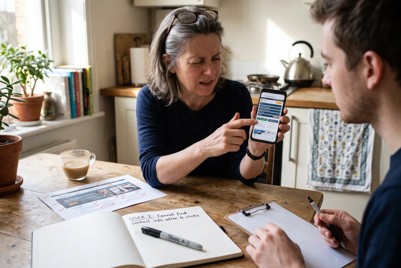
- Navigation. Try finding your pricing, services, and contact details as a stranger would. If it takes more than two clicks, that’s a problem.
- A simple usability test. Ask three or four people outside your business to find a specific thing on your site, like a phone number or price, while you watch and say nothing.
Sort your fixes by effort and payoff
Your audit probably turned up ten problems, maybe twenty. Trying to fix all of them at once is how redesigns stall for months. Instead, sort each item into one of two questions: how much will this improve results, and how much work will it take?
Fixes that score high on impact and low on effort are your quick wins, and they should be done first. If your “Get a Quote” form is broken or your main CTA button is buried below three paragraphs of text, fix that this week. These are pages people reach right before they were about to become a customer, so a small fix there earns you conversions immediately.
Bigger jobs, like rebuilding your homepage layout or moving to a new template, are high impact but high effort. They’re worth doing, but they need planning, so schedule them rather than starting them today.
Then there’s the low-value stuff: minor wording tweaks, styling on a page nobody visits, a font colour change on your footer. Fine to knock out when you’ve got a spare hour, but don’t let them eat time meant for higher-priority work.
If a task is both low impact and a lot of effort, like redesigning a rarely-visited “Our History” page, leave it. It’s not worth your weekend.

Sort every fix into one of four boxes and you will always know what to tackle first.
Five principles worth applying to every page
Once you know what to fix, use these five ideas to guide how you fix it.
CTA. Your call-to-action button should tell people exactly what happens next, using an action verb like Shop, Book, Download, or Join, rather than something vague like “Click here” or “Submit”. A tradesperson’s site works better with “Book your free quote” than “Submit enquiry”, because it names the action and removes any guesswork about what happens after clicking.
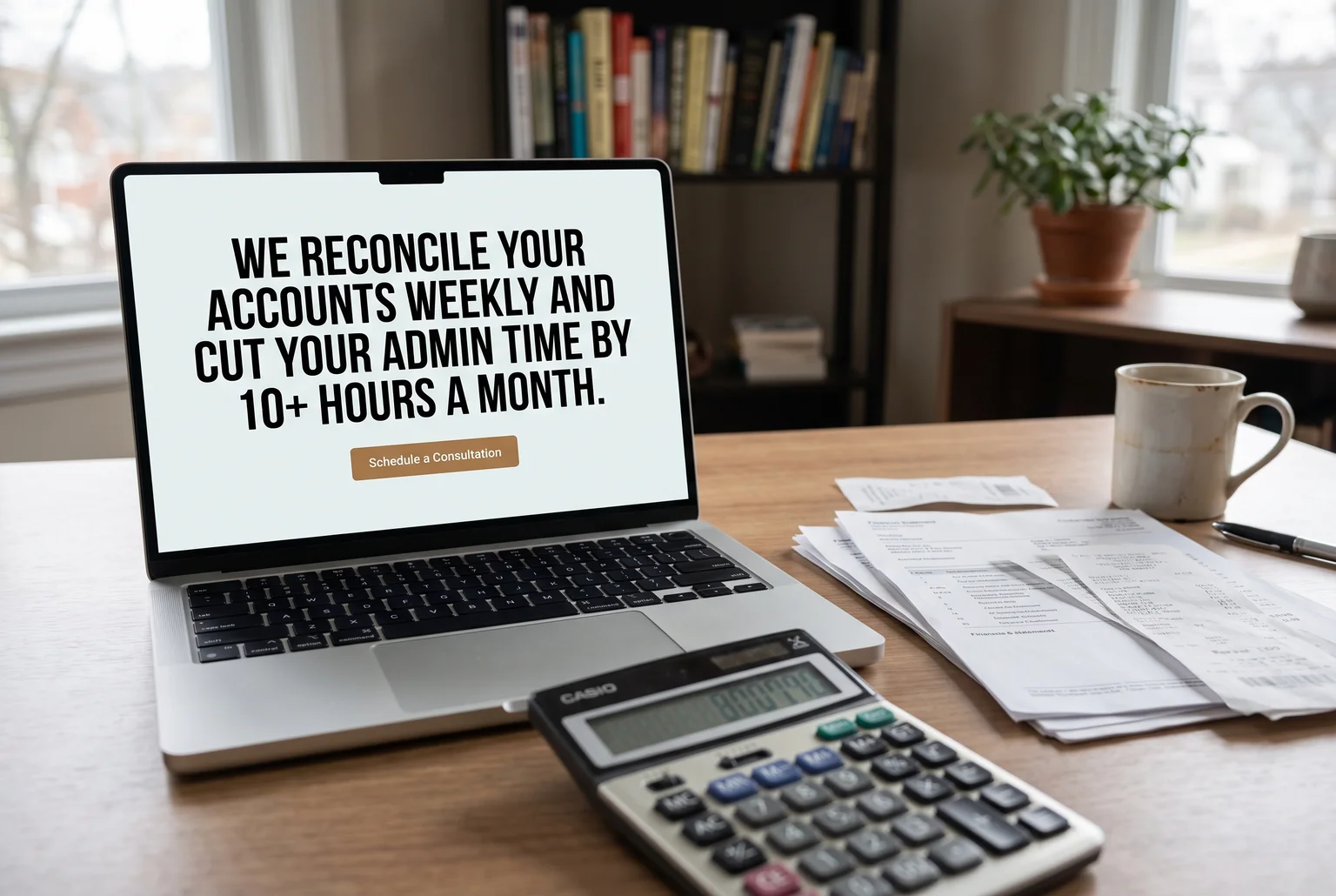
VALUE PROP. The headline and first few lines above the fold need to answer three things fast: what you do, who it’s for, and why someone should pick you over the next search result. A bookkeeper’s homepage might read “We reconcile your accounts weekly and cut your admin time by 10+ hours a month,” which is a specific outcome a stressed business owner can picture straight away.
TRUST. People hesitate to hand over money or contact details to a business they don’t recognise. A review, a certification badge, or a simple guarantee near your button or form reduces that hesitation. A tiler might place “10-year workmanship guarantee” right next to the quote button rather than on a separate about page nobody visits.
SPEED. A page that takes too long to load loses visitors before they read a word of your value prop. Compress images, cut unnecessary plugins, and test your site on mobile data, not just office wifi.
FRICTION. Every extra field, click, or step is a chance for someone to give up. Cutting a checkout from four steps to two, or a form from ten fields to four, keeps people moving toward becoming a customer instead of bouncing halfway through.
Rolling out your fixes without breaking anything
Work through your priority list one item at a time, not all at once. If something goes wrong, a single change is easy to trace and undo. Ten changes made in one afternoon are not.
Start with your homepage headline if it made your list. Vague lines like “Welcome to [Your Business Name]” or “Innovative solutions for your business” tell a visitor nothing. Replace them with a headline naming what you do, who it’s for, and the outcome you deliver, something closer to “Web design for Adelaide small businesses that need the phone to ring” than “Your partner in digital excellence.”
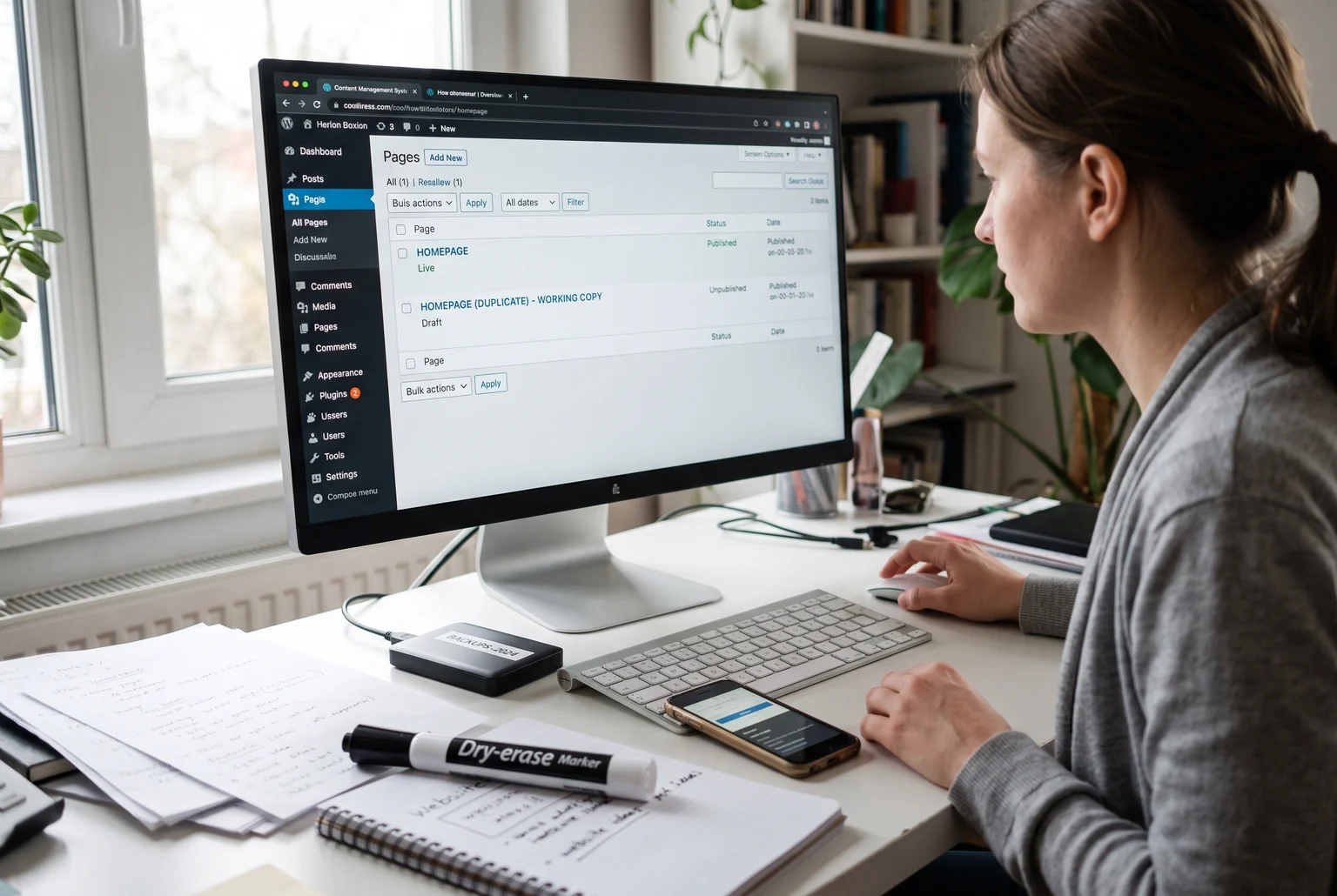
Before you touch that homepage, protect yourself. Duplicate the page in your CMS and leave the copy unpublished, so you have a known-good version to revert to if the redesign falls flat. Name it something obvious, like “Homepage before headline change.” If the edit touches something shared across your site, like a header, footer, or template, take a fuller backup covering your files and database too, not just the one page. Most hosting accounts let you do this through your control panel, or your CMS may have a built-in export option.
Once one change is live, check it looks right on mobile and desktop before moving to the next item on your list.
Did the change actually work?
Formal A/B testing (showing two versions of a page to different visitors at the same time and comparing results) needs a decent volume of traffic before the numbers mean anything. Most small business sites don’t get that traffic, so wait for a “statistically significant” result and you’ll be waiting months.
A before/after comparison works better for you. Measure your conversion rate, calculated as completed actions divided by total visitors, for the two to four weeks before your change, then measure the same period after. If enquiries or calls go up over a similar stretch of time, that’s a decent sign. Keep in mind that seasonality or a change in ad spend can skew the comparison too, so don’t treat it as proof, treat it as a strong hint.
While you wait for those numbers, watch what happens in real time. Track clicks on your main button, how many people start filling out your form, and how far people scroll down the page. These smaller signals often move before your final conversion numbers do, so they’ll tell you sooner whether a change is helping or falling flat.
If you know a handful of people who match your customers, ask them to find your phone number or book a service on the new page while you watch. Watching someone hesitate on your homepage tells you more than any spreadsheet.
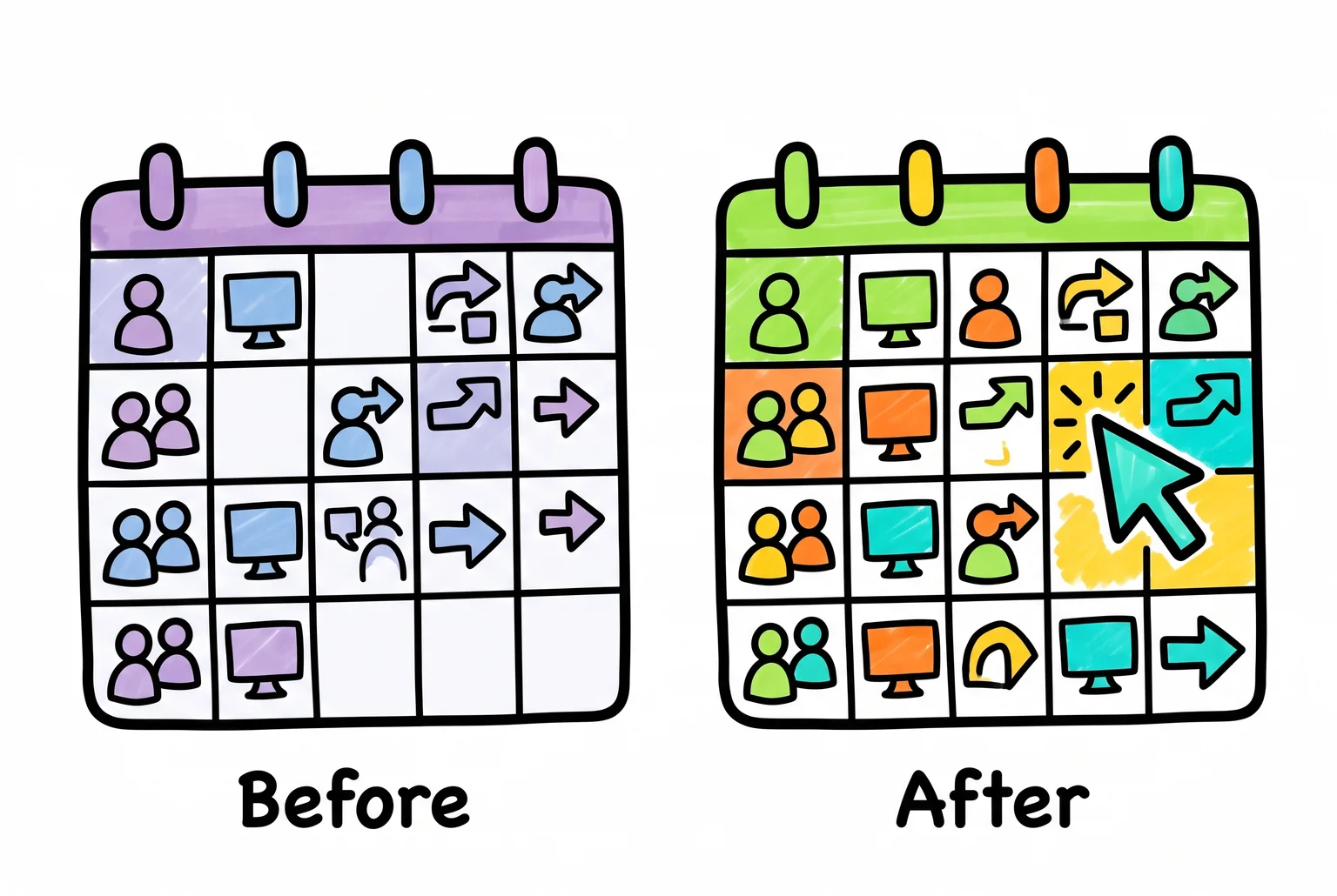
When you do not have enough visitors for a real split test, comparing a month before to a month after is often the clearest signal you will get.
Your website is never really finished
Once you’ve made your changes and checked the results, don’t file the redesign away as a finished project. Customer expectations shift, your business changes, and what worked this year may not work next year. Set a reminder to run through the audit, prioritise, redesign, and test steps again in three to six months.
You don’t need to overhaul the whole site each time. Pick one or two pages, check them against the same checklist you used the first time, and fix whatever’s slipping. Small, regular passes beat a once-off scramble every few years.
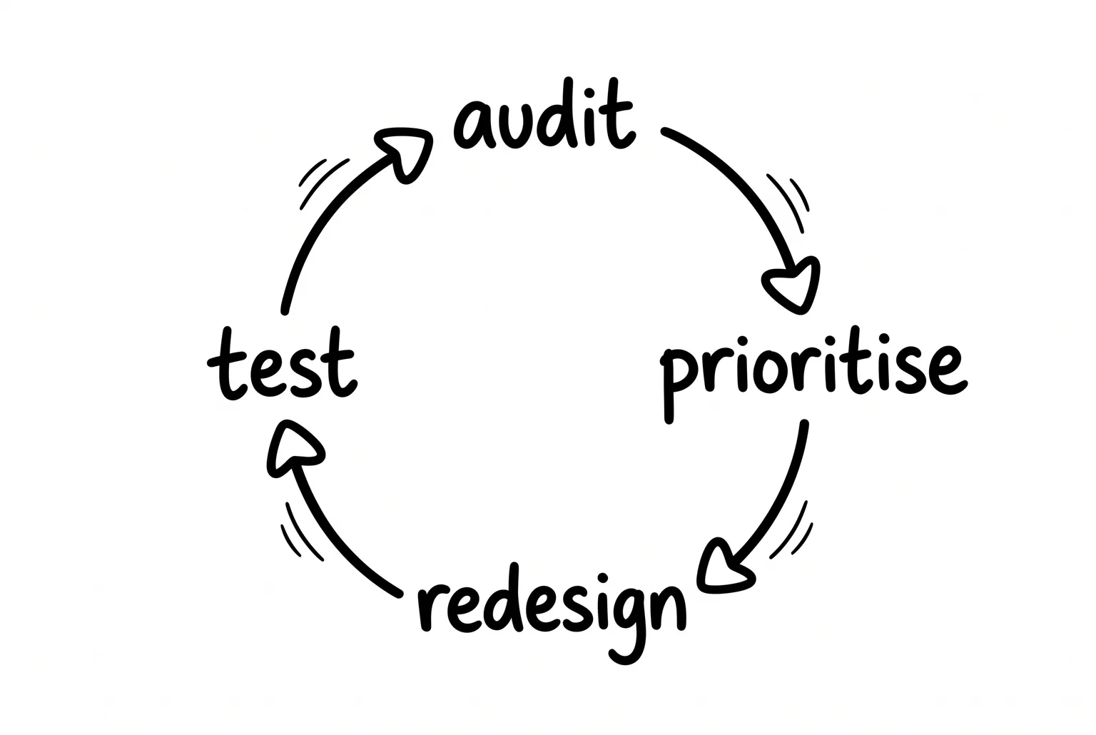
Your site is a working tool, not a finished brochure. Keep testing, keep adjusting, and it’ll keep earning its place on your customer’s screen.