
Trust signals are the specific elements on a website that remove perceived risk and push a visitor toward saying yes: verified reviews, explicit guarantees, visible contact details, and secure checkout markers. If you fix only three things this week, fix these: add third-party verified reviews near your pricing, state a clear guarantee or refund policy, and put a real phone number and address where a visitor can see them without scrolling.
TL;DR:
- Verified third-party reviews, specific testimonials with measurable results, and clear guarantees significantly reduce visitor hesitation and increase conversion rates.
- Trust signals should be placed near the call-to-action on every page type, with checkout and pricing pages emphasizing security, guarantees, and contact details.
- Technical trust factors like HTTPS, security headers, and Core Web Vitals are critical for user confidence and should be checked regularly to prevent silent regressions.
- Common trust-killing mistakes include vague testimonials, inconsistent branding, badge overload, and outdated proof, which undermine visitor credibility.
- Conducting a quick 30-minute trust audit can reveal the most impactful gaps, especially ensuring trust elements are specific, verifiable, and positioned within the decision zone.
Table of Contents
- What Are Trust Signals on a Website, and What Are the Main Types?
- Which Trust Signals Actually Move the Needle?
- Where Should Trust Signals Go on Your Site?
- Do Technical Signals Like HTTPS and Core Web Vitals Really Affect Trust?
- How Do Trust Signals Actually Change Visitor Behavior?
- What Trust Signal Mistakes Quietly Kill Conversions?
- The 30-Minute Trust Audit You Can Run Today
- How Webby Approaches Trust-Signal Work for Local Service Businesses
- How Should Trust Signals Fit Your Brand and Design?
- Ready to Turn Your Website Into a Trust Machine?
- Editorial Take: Trust Is a Design Discipline, Not a Checklist
- Sources
What Are Trust Signals on a Website, and What Are the Main Types?
Trust signals fall into four working categories, and most sites lean too hard on one while ignoring the rest. Knowing the categories matters because a signal that works on your homepage often does nothing on a checkout page.
- Social proof. Reviews, star ratings, testimonials, case studies, “as seen in” logos, follower counts. This works by showing that other people already took the risk and it paid off.
- Human signals. Real staff photos, named authors, an about page with an actual history, active social profiles that match what the site claims. Visitors check whether the people behind a business are real before they hand over money.
- Technical and security signals. HTTPS padlocks, payment badges, privacy policies, visible security certifications. These matter most at the exact moment someone is about to enter payment details.
- Guarantees and risk reversal. Money-back promises, free trials, transparent pricing, clear refund windows. This category does the heaviest lifting because it removes risk instead of just implying trustworthiness.
Different page types call for different mixes. A homepage needs social proof and human signals to earn a few extra seconds of attention. A checkout page needs security and guarantee signals almost exclusively, because that’s the moment risk perception spikes. Walk through your own site and sort what you already have into these four buckets. Most small business sites are heavy on generic testimonials and completely missing risk reversal. That gap is usually the cheapest one to close.
Which Trust Signals Actually Move the Needle?
Not every badge or quote carries equal weight. Some signals are trivial to fake, so visitors have learned to skim past them. Others are hard to fabricate, and those are the ones worth your limited time. Here’s the priority order, ranked by how much friction each one actually removes.
- Verified third-party reviews. A rating pulled from Google, Trustpilot, or an industry-specific platform beats a quote you typed yourself, because visitors can click through and check it. High-value trust signals include SSL/HTTPS, verified third-party reviews, and detailed testimonials with photos precisely because they’re harder to fake.
- Specific testimonials and case studies. “Great service!” convinces nobody. A testimonial with a name, a role, a photo, and a measurable result (“cut our callback rate by 40% in six weeks”) reads as real because it’s specific enough to check.
- Guarantees and risk reversal. A named refund window or a “no results, no charge” clause does more persuasive work than five badges combined, since it removes the buyer’s downside instead of just describing your reliability.
- Visible contact information and policies. A real address, a phone number that gets answered, and a plainly written refund policy. Vague “contact us” forms with no phone number read as evasive.
- Security and checkout badges. SSL padlocks, recognized payment logos, and privacy assurances matter enormously at checkout and barely at all on a blog post.
What separates a strong version of each signal from a weak one usually comes down to specificity: a dated case study beats an undated one, a testimonial with a headshot beats an anonymous quote, and a guarantee with an exact number of days beats “satisfaction guaranteed.” The strongest trust signals are the ones that remove risk entirely, like guarantees and named case studies, rather than ones that simply assert quality.
Pro Tip: Before publishing a new testimonial, link it to a verifiable source, an actual review page, a LinkedIn profile, a dated case study. If you can’t verify it yourself in under a minute, a skeptical visitor won’t either, and it will read as staged.
Start your rollout by testing one thing at a time. Add the guarantee statement first since it’s usually a one-line copy change, then layer in verified reviews near your main CTA, then tackle testimonials with real names and outcomes.
Where Should Trust Signals Go on Your Site?
Placement decides whether a trust signal gets seen at the exact moment it matters, or gets scrolled past and wasted. The rule that governs almost everything else: a trust signal works best within the same screen as the decision it’s meant to influence.
- Homepage, above the fold. One clear trust element, a star rating, a client logo bar, or a one-line guarantee, should sit in the first screen a visitor sees. Visitors form a trust judgment within a fraction of a second, so waiting until the third scroll to introduce credibility is too late for a meaningful share of your traffic.
- Landing pages. Match the trust signal to the specific offer. A page selling emergency plumbing needs a “licensed and insured” badge and a phone number, not a generic “10,000 happy customers” banner.
- Product and service pages. Pair the price with a guarantee and at least one relevant, specific testimonial right next to the “Book Now” or “Add to Cart” button.
- Pricing pages. This is where guarantees do the most work. If you offer a refund window, state it beside the price, not buried in a footer link.
- Checkout and forms. Security badges, an accepted-payment-methods row, a visible refund policy link, and real contact details all belong here. This is the highest-risk moment in the entire visit, and it deserves the most reassurance.
The underlying principle is proximity. Placing a trust element adjacent to every call-to-action reduces friction at the exact decision point, rather than making the visitor hunt for reassurance elsewhere on the page. If your testimonials live on a separate “Reviews” page that nobody visits, they’re not doing any work.
Do Technical Signals Like HTTPS and Core Web Vitals Really Affect Trust?
Yes, and they’re the signals most business owners never think to check. Technical trust is invisible when it’s working and glaring when it’s broken, one browser warning about an insecure connection can undo every testimonial on the page.
Start with the basics that visitors and browsers both check automatically:
- HTTPS with a valid TLS certificate. Mixed content warnings, where a secure page loads an insecure image or script, trigger browser alerts that scare visitors off instantly.
- Security headers. Content-Security-Policy and HSTS headers aren’t visible to a typical visitor, but they matter to procurement teams and security-conscious buyers doing due diligence before signing a contract.
- Core Web Vitals. Slow, janky pages read as unprofessional even when the content is solid. A visitor rarely thinks “poor Largest Contentful Paint,” they just think “this site feels cheap” and leave.
- Structured data. Organization, Person, and AggregateRating schema help search engines display your ratings and business details accurately, but only add AggregateRating markup if the ratings are real and verifiable. Fake or inflated schema is a fast way to get penalized.
Technical implementation, TLS, security headers, structured data, and performance budgets, is a high-leverage area that prevents silent regressions, meaning a site that looked secure and fast last year can quietly degrade without anyone noticing until conversions drop.
A significant share of checkout abandonment traces directly to payment and trust concerns, according to Baymard Institute research cited in industry analysis, underscoring why technical polish at checkout isn’t optional.
Run these checks quarterly, not once. A tool like Webby Website Optimisation’s speed and structure reviews can catch a slipping Core Web Vitals score before it costs you leads.
How Do Trust Signals Actually Change Visitor Behavior?
Trust signals work by short-circuiting the mental math a visitor runs before committing: is this safe, will this work, and what happens if it doesn’t? Each category of signal answers a different piece of that calculation. Social proof answers “did this work for someone like me?” Guarantees answer “what’s my downside if it doesn’t?” Security badges answer “is it safe to enter my card number here?”
More content does not automatically build more trust. Clarity, consistency, and removing friction from the decision matter more than volume, a single specific guarantee outperforms five paragraphs explaining why your company is trustworthy.
That distinction explains why some sites with sparse copy convert better than content-heavy competitors: they’ve reduced cognitive load rather than adding reassurance nobody reads. The metrics worth watching after you add or reposition a signal are checkout abandonment rate, time-to-decision on pricing pages, and bounce rate on your highest-traffic landing page. Movement in those three numbers, more than pageviews or time on site, tells you whether a signal actually reduced risk or just added visual clutter.
What Trust Signal Mistakes Quietly Kill Conversions?
The most common failure isn’t missing trust signals, it’s cramming in too many weak ones while skipping the strong ones. A wall of badges from obscure “award” sites reads as filler, not credibility, and visitors have gotten good at spotting the difference.
- Vague testimonials with no name or outcome. “Amazing service, highly recommend!” with no attribution reads as fabricated, because it might be. Fix it by adding a full name, role, and specific result.
- Inconsistent identity across platforms. A LinkedIn profile with a different job title than the website, or a “team” page with stock photos. Mismatches between a site’s claims and its social profiles create subconscious distrust even when a visitor can’t articulate why they hesitated.
- Badge overload. Ten security seals crammed into a footer signal insecurity, not safety. Keep two or three that visitors actually recognize.
- Outdated proof. A “2019 client of the year” badge or a testimonial with no date makes readers wonder what’s changed since then.
Judge authenticity by askability: can a visitor click through and verify the claim in under 30 seconds? If not, rewrite or remove it.
The 30-Minute Trust Audit You Can Run Today
You don’t need a full redesign to find your biggest gaps. Block off half an hour and work through this in order.
- Five-second first-impression check. Load your homepage on a phone. Is your business clearly identified, and is one trust element (rating, guarantee, or client logo) visible without scrolling?
- CTA adjacency check. Look at every major “Buy,” “Book,” or “Contact” button. Is a trust signal, review, guarantee, or security badge within the same screen?
- Checkout and form check. Open your contact form or checkout flow. Is there a visible phone number, a stated refund policy, and a security badge before the payment field?
- Technical spot check. Confirm HTTPS loads cleanly with no mixed-content warnings, and run a quick Core Web Vitals check on your busiest page.
| Fast win | Time to fix | Why it matters |
|---|---|---|
| Add one verified testimonial with name and outcome | 30 seconds | Replaces vague praise with checkable proof |
| State refund or guarantee terms near pricing | 10 minutes | Removes risk at the exact decision point |
| Fix any mixed-content or HTTPS warning | half an hour | Prevents browser warnings that scare off buyers |
| Add real phone number to header/footer | 5 minutes | Signals a human is reachable, not just a form |
These four fixes rarely require a developer, and most business owners can knock out all four in a single afternoon.
How Webby Approaches Trust-Signal Work for Local Service Businesses
Steve Doig, who leads strategy at Webby Website Optimisation, has spent years building and auditing sites for local service businesses across trades, health, and professional services, the exact category where a missing phone number or an expired SSL certificate costs a lead before the phone ever rings. Webby’s project work consistently pairs technical fixes (HTTPS, Core Web Vitals, structured data) with conversion-focused design, because a fast, secure site with no social proof converts about as poorly as a slow site full of glowing reviews. Case studies from Webby’s SEO and web development work show that ranking improvements and traffic gains only translate into leads when the landing pages they drive to actually carry believable trust signals near the CTA. Local clients who added verified reviews and a stated guarantee alongside existing SEO gains typically saw the improvement show up in inquiry volume, not just search position, a reminder that traffic and trust are separate problems that both need solving.
How Should Trust Signals Fit Your Brand and Design?
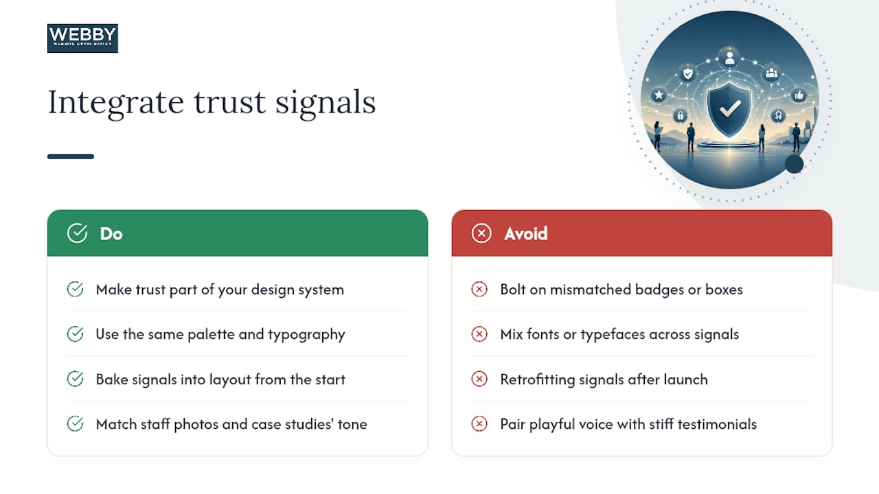
Trust signals fail when they look bolted on, a mismatched badge font, a testimonial box that clashes with your color scheme, a guarantee banner in a different typeface than the rest of the page. Visitors register that inconsistency even when they can’t name it, and it quietly undercuts the very credibility the signal was supposed to build.
The fix is to treat trust elements as part of your design system, not an afterthought layered on top of it. If your brand uses a specific color palette and typography, your review widget, guarantee badge, and testimonial cards should use the same palette and type. A professionally designed site built with conversion architecture in mind tends to bake trust signals into the layout from the start, rather than retrofitting them after launch.

This also means your human signals, staff photos, about page, named case studies, should match the tone of the rest of your brand. A playful, casual brand voice paired with stiff corporate testimonials feels off. A serious, high-trust industry like legal or medical services needs its guarantees and credentials to read with the same gravity as the rest of the copy. Consistency here isn’t cosmetic; it’s the difference between a trust signal that reinforces your brand and one that quietly contradicts it. Check your review widgets, badges, and testimonial layouts against your actual style guide, not just for compliance, but because a jarring visual mismatch is often the first thing a skeptical visitor notices.
Ready to Turn Your Website Into a Trust Machine?
Most of what’s covered here doesn’t require a rebuild, it requires someone to actually run the audit and fix what it finds. If your site is slow, your testimonials are vague, or your checkout page looks like an afterthought, that’s exactly the kind of gap Webby Website Optimisation’s website design and development service is built to close, pairing technical fixes with conversion-focused layout so the traffic your SEO earns actually turns into booked jobs. If you need something faster, the website built in a day option covers the rapid-fix version of this same work for businesses that can’t wait for a full redesign cycle.
Editorial Take: Trust Is a Design Discipline, Not a Checklist
The conventional advice on trust signals treats them like ingredients: sprinkle in a badge here, a testimonial there, and credibility follows. That’s backwards. The research points somewhere less convenient: trust is a function of removing risk at the exact moment a visitor is deciding, not accumulating reassurance elsewhere on the page. A guarantee statement placed three screens away from your pricing does almost nothing. The same guarantee placed next to the “Book Now” button changes behavior.
Where most small business sites fail isn’t a lack of trust signals, it’s a lack of specificity. Vague testimonials, unstated guarantees, and generic security badges all fail for the same reason: they can’t be checked. The fix isn’t more content. It’s replacing every vague claim with one a skeptical visitor could verify in under a minute.
If you do only one thing after reading this, run the 30-minute audit. Most businesses find their biggest leak isn’t a missing badge, it’s a guarantee that exists somewhere on the site but never sits next to the button that needs it.
— Steve Doig
Sources
- You have 1/20th of a second — does your site gain trust in time? — Shopify
- Trust Signals for Websites: The Complete Guide | TeardownHQ