
The fastest way to lift contact-form conversions is to trim the form to a single column, ask for no more than three to five fields, and end on a CTA that names the outcome rather than the action. Keep tap targets at 44 pixels or larger, add a one-line privacy note by the submit button, and route every submission to a monitored inbox with a named owner. This pattern is often built into client sites as it is a high-leverage fix on many local service pages.
TL;DR:
- Reducing contact form fields to three to five and using a single-column layout significantly lowers abandonment without harming lead quality.
- Including outcome-oriented CTAs and a short privacy note near the submit button increases user trust and click-through rates.
- Ensuring tap targets are at least 44 pixels and labels remain visible on mobile improves accessibility and usability across devices.
- Regularly testing submission routing and operational functionality prevents silent failures that can cost leads.
- Focusing on reliability and response time promises over design polish yields higher conversion than complex layouts or excessive fields.
Table of Contents
- Contact Form Design Examples Worth Copying
- What Fields and Layout Should a Contact Form Have?
- Which Microcopy and CTA Wording Convert Best?
- How Do You Make a Contact Form Mobile-Friendly and Accessible?
- What Should You Track to Improve Form Performance?
- WordPress Fixes That Stop Silent Contact Form Failures
- Three Fixes That Matter More Than the Rest
- How Webby Can Fix Your Contact Form This Week
- Sources
- FAQ
Contact Form Design Examples Worth Copying
Most contact form design mistakes trace back to copying a template without asking what the form is actually for. A sales form and a general enquiry form should look different, and the examples below each solve a distinct job.
- Simple contact form (name, email, message) for general enquiries. Use it on “About” or footer contact pages where the visitor just wants a fast way to say hello. Success metric: submission volume, not lead quality.
- Qualification-first form with a topic dropdown and one qualifying question (“What’s your budget range?”) for sales-driven pages. This filters tire-kickers before a human ever sees the lead.
- Multi-step or progressive-disclosure form that reveals fields in stages, useful for detailed intake (quote requests, project scoping) where five fields upfront would scare people off. Progressive profiling lets you collect depth without the abandonment cost of a long single page.
- Conversational single-question flow (one field, one prompt at a time) works well for brands with a strong personality or younger audience, but it’s slower to complete and a poor fit for B2B decision-makers scanning quickly on mobile.
- Footer-minimal form, just email and message, for content sites where contact is secondary to the main conversion path.
- Sticky or persistent contact widget on long landing pages, so a reader ten screens deep doesn’t have to scroll back up.
Design galleries like Dribbble’s contact form collection are genuinely useful for visual inspiration, but treat them as mood boards, not blueprints. A gorgeous glassmorphic form with floating labels can still fail on a real phone if the tap targets are 30 pixels apart. Pull the layout idea, then run it through the usability rules in the next section before it goes live.
What Fields and Layout Should a Contact Form Have?
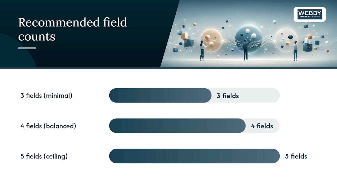
Every field you add is a reason someone abandons the form. The rule that holds up across most service-business sites: keep only the fields you’ll actually use to follow up, and treat five fields as a hard ceiling. Practitioner data backs this up: ruthless field reduction, often down to three to five fields, consistently reduces abandonment without hurting lead quality.
Here’s the build order that works for most contact form UI design projects:
- Audit your fields first. For each one, ask “what would I do differently if I didn’t have this answer?” If the honest answer is nothing, cut it.
- Go single-column. Multi-column layouts force the eye to jump around, which slows completion on desktop and breaks outright on mobile.
- Top-align every label. Labels beside fields save vertical space but cost scanability, especially for anyone reading quickly or using a screen reader.
- Set input types deliberately. Use
type="email",type="tel", andautocompleteattributes so mobile browsers can offer the right keyboard and autofill saved details. - Build routing logic before launch, not after. A topic dropdown that maps to specific recipients (sales, support, careers) beats a single “message” box that dumps everything into one inbox nobody checks daily.
Pro Tip: Test your own contact form once a month by submitting it from your phone. It’s the fastest way to catch a broken routing rule or a silently failing plugin before a real customer hits it.
Spacing matters more than most designers give it credit for. Generous padding between fields, a message box that’s visibly larger than the others, and clear visual separation between the form and surrounding page content all reduce the cognitive load of “where do I click next.”
Which Microcopy and CTA Wording Convert Best?
Generic CTA copy is one of the most common contact form UI design mistakes. “Submit” tells the visitor nothing about what happens next. Outcome-oriented copy does the work instead:
- “Get My Free Quote” instead of “Submit”
- “Send My Message” instead of “Submit Form”
- “Book My Free Audit” instead of “Contact Us”
Small, consistent wins like this, paired with field reduction and a trust note near the button, tend to be the three highest-impact changes a team can make without touching layout at all.
Placeholder text should never replace a label. Placeholders vanish the moment someone starts typing, which is exactly when a person with memory or attention difficulty most needs the label still visible. Use placeholders only for format hints (“e.g., (08) 9123 4567”), never as the only field description.
Right beside the submit button, add a short privacy line and a response-time promise: “We reply within one business day. Your details stay private.” That combination directly addresses the anxiety that makes people hesitate before clicking, and it aligns with the kind of privacy transparency the Australian Privacy Principles expect businesses to offer around personal data collection. Microcopy describing what happens after the click, rather than a vague reassurance, tends to reduce hesitation more effectively than generic trust badges alone.
How Do You Make a Contact Form Mobile-Friendly and Accessible?
A form that looks clean on a 27-inch monitor can be nearly unusable on a phone if the basics get skipped. Check these before anything ships:
- Keep every tappable element at 44 pixels or larger, with enough spacing around each one to prevent mis-taps on smaller screens.
- Use the correct input type for each field so mobile keyboards switch automatically (numeric pad for phone numbers, email layout for addresses) and autofill can populate saved details.
- Keep labels visible at all times, whether static above the field or as an accessible floating label that shifts up rather than disappearing.
- Make inline validation scroll the page to the exact error, with a plain-language message (“Enter a valid email address”) rather than a generic “Error” flag.
- Place the form above the fold on dedicated landing pages; on longer pages, use a sticky button or persistent link so it’s always one tap away.
Responsive layout choices affect this more than most teams expect, and it’s worth reviewing general responsive web design practices alongside form-specific rules, since the two overlap constantly on real projects.
What Should You Track to Improve Form Performance?
Submission count alone hides the real story. A form that gets fifty submissions a month but only three are legitimate leads has a targeting problem, not a volume problem. Track both raw submissions and the qualified-submission rate, and watch field-level abandonment closely, since it points directly to which field is causing people to quit.
Run these tests in this order:
- Remove one field from your current form and measure completion rate over two to four weeks before touching anything else.
- Rewrite the CTA copy to name the outcome, then compare submission rate against the baseline.
- Add a short privacy note near the button and watch whether completion rate shifts, particularly on forms asking for phone numbers.
- Run monthly operational checks: submit the form yourself, confirm the alert reaches the right inbox, and confirm the thank-you page actually loads. These operational tests catch the silent failures that plugin or theme updates cause more often than most site owners realize.
Structural changes like progressive disclosure and automatic recipient routing come later. They take more development time, so tackle field reduction and copy first, then measure whether the bigger rebuild is worth the effort. For a deeper look at how these numbers connect to overall site performance, see this guide on improving page conversion rates.
WordPress Fixes That Stop Silent Contact Form Failures
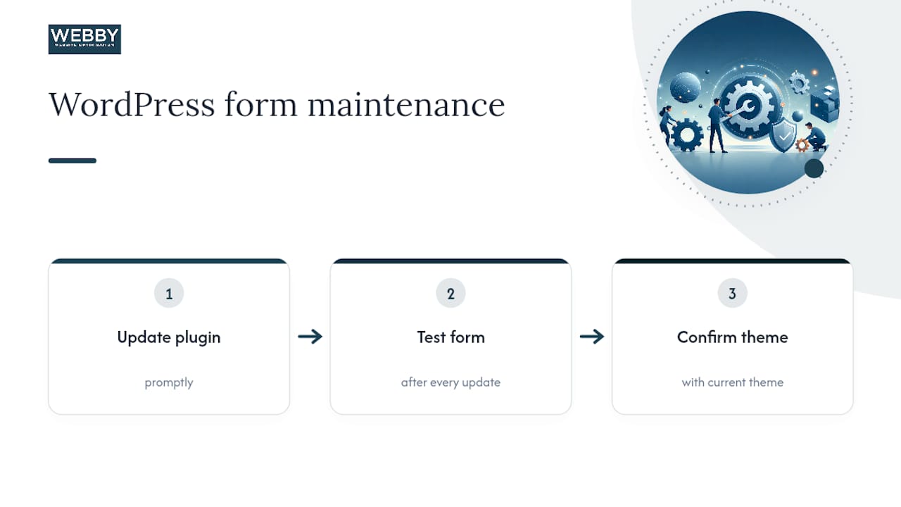
Most WordPress contact form problems aren’t design problems, they’re plugin problems. The WordPress plugin directory hosts dozens of contact form options, and each one needs the same hygiene: update it promptly, test the form after every update, and confirm it still works with your current theme.
For spam, skip image CAPTCHAs. Honeypot fields and invisible time-based checks catch bots just as effectively without adding friction for real visitors, a distinction covered in more detail in this guide to stopping WordPress contact form spam without CAPTCHA. On the routing side, confirm every submission lands in a shared inbox with a named owner and a fallback contact, never a single person’s personal email that goes unchecked during leave.
Three Fixes That Matter More Than the Rest
If you only fix three things, fix these: cut the field count, rewrite the CTA around the outcome the visitor actually wants, and commit to a reply time you can genuinely meet. Businesses that promise a 24-hour response and then hit it consistently tend to see fewer abandoned leads simply because the anxiety of “will anyone even see this” disappears. Design polish matters less than most designers want to admit; reliability is what turns a submission into a customer.
— Steve Doig
How Webby Can Fix Your Contact Form This Week
Webby Website Optimisation is the alternative to guessing your way through a form redesign. Instead of trial and error, a Website Audit gives you a specific list of what’s costing you leads, from field count to routing errors to mobile tap-target problems, at a fixed one-off price rather than an open-ended hourly bill.

If your site already has bigger conversion gaps beyond the contact form, the Business Website Optimisation Campaign covers a broader fix across the full page, not just the form. And if the underlying issue is a WordPress site that breaks every time a plugin updates, WordPress Help & Support starts at $59 AUD a month for ongoing maintenance, with emergency fixes billed at $120 AUD an hour when something breaks between check-ins. For law firms and other regulated service businesses with stricter intake requirements, a purpose-built approach like custom law firm website design shows how industry-specific form logic gets handled. Start with the audit, and you’ll know exactly what to fix first.
Sources
FAQ
How Do I Create a Contact Form?
Start with a single-column layout, three to five fields (name, email, and message at minimum), and a topic dropdown if multiple teams need to receive leads. Add top-aligned labels, an outcome-focused CTA, and a short privacy note near the submit button, then test it on your own phone before publishing.
Where Can I Find Contact Form Templates?
Design galleries like Dribbble’s contact form tag offer visual inspiration, and most WordPress form plugins in the official plugin directory include prebuilt templates you can adapt. Treat any template as a starting point, not a finished product, and check tap-target size and field count before publishing.
What Is the Purpose of a Contact Form?
A contact form gives visitors a low-friction way to reach a business without needing an email client, and it gives the business a structured, routable record of every enquiry. Done well, it also qualifies leads before they ever reach a salesperson through smart field choices.
What Should You Put on a Contact Form?
Stick to name, email, and message as the core, adding a phone number or topic dropdown only if you genuinely need it to route or follow up. Practitioner guidance consistently points to three to five fields as the ceiling for most service-business contact pages.