
A PPC landing page is a single, standalone page built to receive traffic from one specific ad and push visitors toward one specific action, unlike a homepage, which juggles navigation and multiple goals at once. The single biggest priority is message match: the headline, offer, and imagery on the page need to mirror the exact ad copy and keyword that got the click. Get that right, along with a single conversion goal, and both conversion rate and Quality Score improve.
TL;DR:
- Message match between ad copy and landing page headline is critical to prevent wasted ad spend and improve conversion rates.
- The ideal landing page template varies based on the offer’s complexity: short forms for low-commitment, proof elements for paid sales, and longer pages for education-heavy deals.
- Simplicity in design—fast load times, minimal form fields, focused CTA, and specific trust signals—outperforms more elaborate, slower pages.
- Testing should prioritize headlines first, then trust signals and offer framing, with form length and CTA copy tested later for incremental improvements.
- Ensuring mobile usability, speed, and tracking setup before launching can significantly improve PPC performance and reduce wasted spend.
Table of Contents
- PPC Landing Page Design Examples and Templates You Can Copy
- What Are the Best Practices for PPC Landing Pages?
- Copywriting and Visual Choices That Actually Move Conversions
- How Should You A/B Test a PPC Landing Page?
- Pre-Launch Checklist Before You Send Paid Traffic
- How a Practitioner Actually Builds These Pages
- Where Most PPC Landing Pages Actually Fall Apart
- Get Your Landing Pages Built or Fixed by Webby Website Optimisation
- Sources
- FAQ
PPC Landing Page Design Examples and Templates You Can Copy
Most high-performing pages fall into one of three patterns, and picking the right one depends entirely on what you’re asking the visitor to do.
The short lead-gen hero. This is the workhorse template for local service businesses: plumbers, dentists, lawyers, HVAC companies. One screen holds a headline, a one-line subhead, a short form (name, phone, maybe one qualifying question), and a button. No scrolling required to convert. Shopify’s guide to PPC landing pages points out that stripping navigation entirely from this layout keeps visitors from wandering off before they act.
The product purchase hero. E-commerce and single-SKU campaigns need more visual proof before someone pulls out a card: a product shot, price, a short benefit list, and reviews or star ratings positioned close to the buy button. This template runs longer because price objections need answering somewhere on the page, but the “buy now” or “add to cart” action still needs to be reachable within one scroll on mobile.
The trial or signup flow. Software and subscription offers do best with a hero that states the outcome (not the feature), a single email field, and a secondary section addressing the most common hesitation, usually cost or commitment. Reassurance microcopy like “no card required” belongs directly under the button here.
Each template shares the same skeleton:
- A headline that restates the ad’s promise in plain language
- A subhead that handles the reader’s biggest doubt
- One CTA button, visually dominant, repeated if the page scrolls
- Microcopy under the button removing friction (“Free quote, no obligation”)
- One trust element (reviews, client count, guarantee) placed near the CTA
How do you decide short versus long? Follow the complexity of the ask, not a template preference:
- If the offer is free or low-commitment (a quote, a download), keep the page to one screen.
- If the price is visible and meaningful (a purchase, a paid signup), add proof sections but keep the CTA reachable early.
- If the sale requires education (a complex B2B service or a technical product), a longer page with FAQs and case studies outperforms a short one, because you’re building trust the ad alone couldn’t.
Browsing a PPC landing page builder’s template library is a fast way to see these three patterns in the wild before you build your own.
What Are the Best Practices for PPC Landing Pages?
Some of these rules move the needle by a few percentage points. A handful of them can double your conversion rate. Here’s the order of impact, based on what actually shows up in testing data across the industry.
Message match comes before everything else
If someone clicks an ad for “Emergency Plumber Fremantle” and lands on a generic “Our Services” page, you’ve lost most of them before they even read a word. The headline on the landing page should echo the ad headline almost verbatim. Google Ads’ own guidance is built around this exact principle: the destination should match the ad and the keyword that triggered it. Mismatch is the single most common reason a campaign burns budget without converting.
Your headline has one job
Write the headline like it’s answering the question the ad already raised, not introducing a new one. Outcome first, jargon last. Aim for under eight words where you can manage it: “Fix a Burst Pipe Today” beats “Comprehensive Residential and Commercial Plumbing Solutions” every time. A cluttered headline forces the reader to work for clarity they didn’t ask for.
One CTA, repeated, not diluted
Pick one action. Not “Call or Email or Chat or Download,” just one. Repeat that same button three or four times down the page if it’s long enough to need it, using identical wording each time so there’s no decision fatigue. Directly beneath the button, add a short line that kills hesitation: “Takes 30 seconds. No obligation.” That reassurance microcopy costs nothing to implement and consistently reduces drop-off right at the point of decision, according to HubSpot’s landing page research.
Forms should ask for less, not more
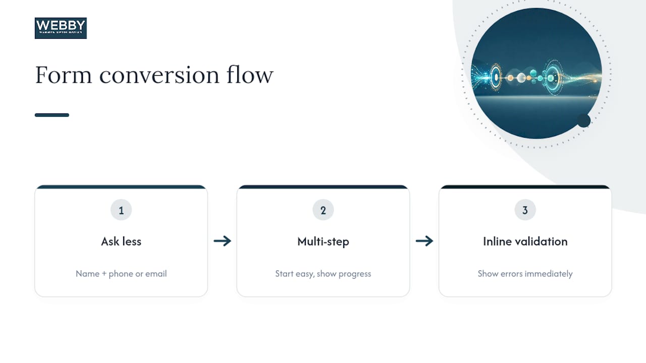
Every additional field is a reason to bounce. If you’re collecting leads, ask for name and phone or email, nothing else, unless a qualifying question genuinely improves lead quality enough to justify the drop-off. For longer forms that need more information, a multi-step format, where the first question is easy and the page shows progress, holds attention better than one long scroll of fields. Inline validation (showing an error the moment a field is wrong, not after submission) keeps frustrated visitors from abandoning the form altogether.
Trust signals need to be specific
“Trusted by many happy customers” convinces nobody. “4.9 stars from 212 reviews on Google” does the actual work, because a concrete number reads as verifiable while a vague claim reads as filler. Put your strongest, most specific proof point above the fold, near the CTA, not buried in a footer nobody scrolls to.
Pro Tip: If you only have room for one trust signal above the fold, use a number your visitor can independently check, a review count, a years-in-business figure, a specific client name. Specificity is what separates proof from marketing copy.
Speed is a conversion feature, not a technical afterthought
A slow page kills conversions before the visitor even reads your headline. Industry benchmarking recommends keeping Largest Contentful Paint (LCP) under 2.5 seconds, one of Google’s core Core Web Vitals thresholds. Compress hero images, serve them in modern formats like WebP, and avoid layout shift by setting explicit image dimensions so the page doesn’t jump around while it loads. A hero video that autoplays might look impressive in a demo, but on a throttled mobile connection it’s often the exact thing tanking your load time.
Here’s a quick reality check most marketers skip: over half of paid search traffic now arrives on a phone, often on a mediocre connection. If your landing page was only ever tested on a fast office Wi Fi connection with a fresh laptop, you have no idea what it actually feels like to your real visitors.
Design mobile-first, not mobile-adjusted
Tap targets need real thumb room, at least 44 pixels tall, with breathing space between them so nobody accidentally taps the wrong link. A sticky CTA bar that stays visible while scrolling on mobile consistently outperforms a button that disappears after the hero section. Stack everything in a single column; side-by-side layouts that look clean on desktop often collapse into a cramped mess on a five-inch screen.
Copywriting and Visual Choices That Actually Move Conversions
Words and images either reinforce the ad promise or quietly undercut it. There’s no neutral middle ground once someone lands on the page.
Headline formulas that work in practice:
- Outcome plus timeframe: “Get a Quote in 60 Seconds”
- Outcome plus specificity: “Fix Your Slow WordPress Site This Week”
- Direct restatement of the ad’s core promise, simplified
The subheadline’s real job is handling the one objection your headline didn’t have room for. If the headline promises speed, the subhead should address cost or trust: “Fixed pricing, no callout fees.” If the headline promises results, the subhead should address credibility: “Backed by a 12 month guarantee.” Skip this step and you leave the visitor’s biggest doubt completely unanswered.
Visuals matter more than most marketers assume. A real screenshot of your dashboard, your finished work, or your product in someone’s actual hands consistently outperforms polished stock photography, because visitors have gotten very good at spotting stock images and mentally discounting them. If you’re a local service business, a photo of your own van, your own technician, or your own completed job builds more trust than any generic smiling-couple-on-a-laptop image ever will.
CTA copy that outperforms generic buttons:
- “Get My Free Quote” beats “Submit”
- “Start My Free Trial” beats “Sign Up”
- “Show Me Pricing” beats “Learn More”
First-person phrasing (“Get My Quote” instead of “Get Your Quote”) tends to nudge conversion higher because it puts the visitor mentally inside the action rather than watching it from outside. Pair that CTA copy with microcopy underneath addressing the last-second doubt: processing time, privacy, or cost. “We never share your info” next to an email field removes a specific, nameable fear rather than a vague one.
How Should You A/B Test a PPC Landing Page?
Test in order of impact, not in order of what’s easiest to change. Tweaking a button color feels productive; it rarely moves the number that matters.
- Headline first. It’s the first thing read and the fastest thing to test. A headline swap alone can shift conversion rate more than any other single change.
- Hero proof second. Test which trust signal or image earns more trust: a specific stat, a review snippet, or a photo.
- Offer framing third. Test how the offer is worded: “Free Quote” versus “No Obligation Estimate” versus “Same Day Response.”
- Form length fourth. Testing data compiled by LanderLab consistently finds form-length reductions produce some of the largest lifts available, often bigger than any visual change you could make.
- CTA copy and color last. Real, but smaller, gains live here.
Don’t call a test early. A simple heuristic: run it until each variant has a few hundred conversions, or two full weeks minimum to smooth out day-of-week noise, whichever comes later. Change one variable per test; running five changes at once tells you something changed, not which change did the work.
| Metric | What it tells you | Where to check it |
|---|---|---|
| Conversion rate | Percentage of visitors who complete the goal action | Google Ads or GA4 |
| Cost per acquisition (CPA) | What each conversion actually costs | Google Ads |
| Bounce rate | Whether the page failed message match | GA4 |
| LCP | How fast the main content loads | PageSpeed Insights |
Keep your GA4 conversion baseline intact between tests. Resetting tracking or changing goal definitions mid-test destroys your ability to compare results honestly, and it’s a mistake worth tracking carefully in your conversion tracking setup before you launch anything.
Pre-Launch Checklist Before You Send Paid Traffic
Run through this before a single dollar of ad spend hits the page.
- Confirm the headline and offer on the landing page match the ad copy and target keyword word for word, or as close as possible.
- Verify GA4 conversion tracking, any ad platform pixels, and form notifications all fire correctly with a real test submission.
- Check that the thank-you page or confirmation step loads properly and, if it’s meant to trigger a conversion event, actually does.
- Test every redirect, especially if the landing page URL differs from what’s in the ad.
- Load the page on an actual phone over a throttled connection, not just a desktop browser resized smaller.
- Confirm tap targets, form fields, and the CTA button are all usable one-handed on mobile.
- Add a visible privacy policy link near any form collecting personal information.
Pro Tip: Test on the oldest phone in your office, not the newest one. If the page loads cleanly on a three-year-old Android with patchy 4G, it will load fine for almost everyone else too.
How a Practitioner Actually Builds These Pages
The process rarely changes even when the industry does: define the single goal first, write the headline before touching design, build the form with the fewest fields the offer allows, then test. Skipping straight to visuals before the goal and headline are locked is one of the most common ways small businesses waste a design budget.
For SMB advertisers, trade-offs are real and worth naming honestly:
- A fast, plain page that loads in under two seconds and converts well often outperforms a beautifully animated one that takes five seconds to render on mobile.
- A two-step form (a single easy question first, contact details second) frequently balances lead quality against completion rate better than either a one-field form or a ten-field form alone.
- Polish comes after proof. Get the headline, offer, and form right first; refine visuals once you know the page actually converts.
[case_study]
Reviewing examples of optimized service pages is a useful way to see how this tradeoff plays out for real local businesses working with limited design budgets.
Where Most PPC Landing Pages Actually Fall Apart
Most landing pages don’t fail because the design is ugly. They fail because someone tried to make one page serve two masters, a lead form and a “learn more” link, and both goals ended up half-baked.
Here’s what I see over and over: a business owner spends weeks perfecting a hero image and a color scheme, then bolts on a five-field form as an afterthought. That’s backwards. The headline and the form are the two things doing almost all the conversion work, and they’re usually the two things given the least attention.
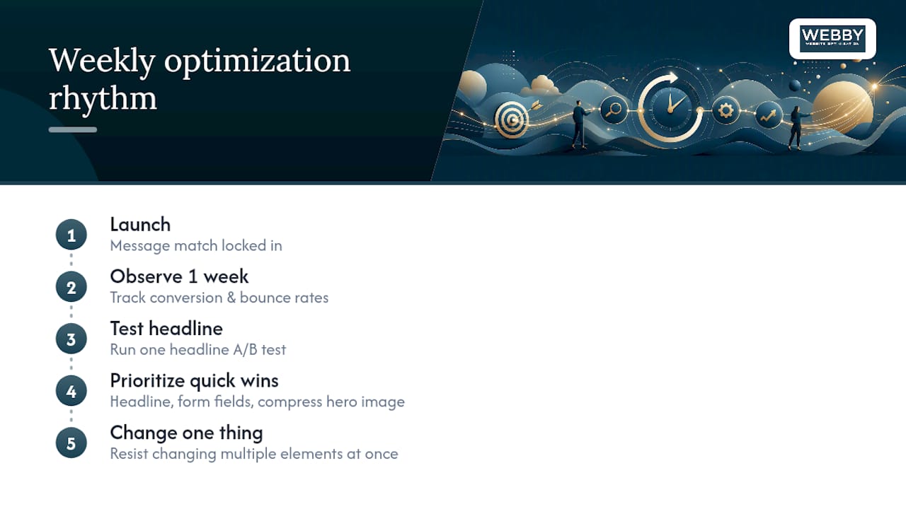
The quickest wins for a small advertiser are rarely expensive. Rewriting a headline to match the ad, cutting a form from six fields to three, and compressing a hero image that’s tanking load time will often outperform a full page redesign. Start there before you touch anything else.
A workable weekly rhythm for a small team: launch with message match locked in, watch conversion rate and bounce rate for a week, then run one headline test before touching anything visual. Resist the urge to change five things at once just because the page “feels” like it needs work.
— Steve Doig
Get Your Landing Pages Built or Fixed by Webby Website Optimisation
Working with a local team that handles the technical side, speed, tracking, WordPress implementation, and the conversion logic in one engagement can be an alternative to hiring a specialist landing page agency or using a DIY builder, rather than stitching together a page builder, a plugin, and guesswork.
If your current pages are already live and underperforming, the Website Audit service reviews message match, load speed, form friction, and tracking setup, and hands you a prioritized list of fixes rather than a vague report. If you need a page built from scratch, Website Design & Development covers the build, and ongoing WordPress Help & Support plans keep speed and plugins maintained after launch so a page that converts well today doesn’t quietly slow down six months from now.
Most engagements start with a look at your current campaign and page setup, then move to a prioritized fix list, headline and form first, visuals later, matching exactly the order of impact covered above. Success gets measured the same way: conversion rate, cost per acquisition, and load time, tracked before and after. Get a website audit started to see where your current landing pages are losing clicks.
Sources
- Create a website or landing page for your ads – Google Ads Help
- Landing page best practices (HubSpot)
- PPC Landing Page Optimization: 15 Strategies That Convert | Sentinel
- Landing Page Best Practices: The Complete 2026 Guide – LanderLab
FAQ
What Is the Best Design for a PPC Landing Page?
The best design matches the ad’s headline and offer exactly, focuses on one conversion goal, and loads in under 2.5 seconds on mobile. Beyond that, the “best” layout depends on whether you’re generating leads, selling a product, or driving signups.
Can ChatGPT Build a Landing Page?
ChatGPT can draft headline options, form copy, and page structure recommendations, but it can’t publish, host, or handle the technical build, speed optimization, or tracking setup a real landing page needs. Most marketers use it for copy drafts, then hand the build to a developer or agency.
How Much Should I Pay for a Landing Page?
Costs vary widely depending on complexity and whether you need ongoing optimization. Webby Website Optimisation’s Website Built in a Day service is priced at $750 AUD one-off for a fast, focused build.
How Do I Design a Landing Page?
Start by defining a single conversion goal, then write a headline that matches your ad, build a short form with minimal fields, add one specific trust signal above the fold, and test the headline first once the page is live.